An E-commerce & Savings App for Flexible Finance. Redesigning trust, one checkout step at a time (7 min read)
E-commerce · Fintech · BNPL
Smosmo.com
Smosmo.com
Smosmo.com
👋🏽 Project overview
👋🏽 Project overview
Paysmosmo had a compelling idea: let Nigerians buy electronics on flexible 6–8 month payment plans.
But a confusing checkout, a broken mobile experience, and disconnected financial tools were pushing users away before they ever completed a purchase. We had 8 weeks to fix it.
Paysmosmo had a compelling idea: let Nigerians buy electronics on flexible 6–8 month payment plans.
But a confusing checkout, a broken mobile experience, and disconnected financial tools were pushing users away before they ever completed a purchase. We had 8 weeks to fix it.
My Role
Product Designer
Product Designer
Research synthesis
Research synthesis
UX strategy
UX strategy
Interaction design
Interaction design
Visual design
Prototype
Prototype
Platforms
Platforms
Web (responsive)
Web (responsive)
iOS
iOS
Android
Android
Year
Year
2023
2023
✅ Introduction
✅ Introduction
Paysmosmo came to our team with a real problem and a real opportunity. Nigerians were already stretching their budgets creatively, borrowing from family, using informal savings circles, and buying on credit from local shops.
Paysmosmo wanted to formalise that behaviour digitally: buy the gadget or appliance you need today, pay it back over six to eight months, transparently and predictably.
The idea was sound. The product wasn’t. The checkout was confusing, the site barely worked on phones, and the savings features nobody was using were buried where nobody would find them.
After 8 weeks of research, iteration, and design, we had a solution ready to build. The client withdrew while development was ongoing.
Paysmosmo came to our team with a real problem and a real opportunity. Nigerians were already stretching their budgets creatively, borrowing from family, using informal savings circles, and buying on credit from local shops.
Paysmosmo wanted to formalise that behaviour digitally: buy the gadget or appliance you need today, pay it back over six to eight months, transparently and predictably.
The idea was sound. The product wasn’t. The checkout was confusing, the site barely worked on phones, and the savings features nobody was using were buried where nobody would find them.
After 8 weeks of research, iteration, and design, we had a solution ready to build. The client withdrew while development was ongoing.
❗ The Problem
❗ The Problem
When we first explored the existing Paysmosmo product, three things became immediately clear: users were arriving, getting confused, and leaving.
The platform had the right ingredients, a product catalogue, a BNPL payment model, savings tools, and an investment section. But they didn’t work together, and individually, several of them were broken.
❌ The four failure points
• A BNPL checkout nobody could finish
The payment setup spanned multiple unclear steps with no progress indicator. Users had no way to see their total repayment amount or monthly instalment until the very last screen, after they’d already invested time in the process. Most abandoned it.
• A site that didn’t work on phones
The existing product was designed desktop-first. On mobile, where the majority of the target audience actually browsed, buttons overlapped, forms were nearly unusable, and key information was cut off.
• Financial tools that felt bolted on
Savings and investment features existed in the product but lived in a side menu nobody opened. There was no connection between the act of buying something and the tools designed to help users manage their money. They felt like two different apps sharing a URL.
• No visual consistency
Different sections of the platform had clearly been built and designed at different times by different people. There was no shared component language, no consistent design system, and no unified branding. It felt unfinished, and to a user deciding whether to trust a platform with their payment details, that matters enormously.
🔎 Research & Discovery
Before touching Figma, we spent the first two weeks of the engagement in research mode. The goal wasn’t to validate the redesign we already had in mind, it was to understand what was actually going wrong and why.
🗣️ Stakeholder interviews
We ran structured interviews with the founding team and product manager to understand the business constraints, the user base they were targeting, and what they believed was causing the drop-off. A few things stood out:
• The team knew the checkout was broken
But didn’t know at which step users were leaving, because there was no analytics instrumentation on the existing flow. This was a significant blind spot.
• The savings feature was a strategic priority
Not just a nice-to-have. The business model depended on users saving within the platform, but the design wasn’t reflecting that importance at all.
• The target user wasn’t who we assumed
Early framing suggested young urban professionals. Stakeholder input revealed the real sweet spot was traders and micro-entrepreneurs in their late 20s to 40s, people with irregular income who made large purchases strategically, not impulsively.
👥 Conversations with potential users
We spoke informally with eight potential and current users, people who matched the target profile and had experience with either BNPL products or informal savings habits. A few patterns emerged quickly:
• Trust was the primary barrier
Not price, not awareness, trust. “How do I know the site won’t just take my money?” came up in almost every conversation. Users needed visible proof that the platform was legitimate before they’d consider entering payment details.
• People wanted to know the total cost upfront
Every person we spoke to said some version of the same thing: “I just want to know what I’ll pay each month and what it adds up to.” The current product only showed this at the final step. That was a critical design failure.
• Mobile was the default
Without exception, everyone we spoke to said they’d use the platform on their phone. The desktop-first experience wasn’t just inconvenient, it was functionally excluding the core audience
• Savings felt abstract
When we described the savings feature, users were interested. When we showed them where it actually lived in the product, they were surprised, most had never found it. “I thought that was just for transfers,” one person said
ℹ️ Feedback from the existing product
We reviewed available user feedback and support queries from the existing platform.
The three most common complaints mapped directly to what we'd heard in interviews: checkout confusion, mobile usability failures, and distrust of the payment process.
This gave us confidence that the qualitative signals from eight conversations were representative of a broader pattern.
We reviewed available user feedback and support queries from the existing platform.
The three most common complaints mapped directly to what we'd heard in interviews: checkout confusion, mobile usability failures, and distrust of the payment process.
This gave us confidence that the qualitative signals from eight conversations were representative of a broader pattern.
📊 Competitive analysis
We audited four reference products: AliExpress and Jumia for e-commerce patterns, CDcare and CredPal for BNPL-specific flows in the Nigerian market.
The most instructive finding was about trust architecture, the platforms users trusted most didn’t just have secure payment systems; they made security visible at every decision point. Logos, badges, plain-language explanations of how money was protected.
Trust wasn’t assumed; it was designed.
We audited four reference products: AliExpress and Jumia for e-commerce patterns, CDcare and CredPal for BNPL-specific flows in the Nigerian market.
The most instructive finding was about trust architecture, the platforms users trusted most didn’t just have secure payment systems; they made security visible at every decision point. Logos, badges, plain-language explanations of how money was protected.
Trust wasn’t assumed; it was designed.
🔬 What the research changed
Going into the project, we’d assumed the primary design problem was the checkout flow.
Coming out of research, we understood it was something deeper: the whole product felt untrustworthy, and the checkout was just where that distrust became a hard stop.
The redesign couldn’t just fix the steps; it had to fix the feeling.
Going into the project, we’d assumed the primary design problem was the checkout flow.
Coming out of research, we understood it was something deeper: the whole product felt untrustworthy, and the checkout was just where that distrust became a hard stop.
The redesign couldn’t just fix the steps; it had to fix the feeling.
🎨 Design Approach
🎨 Design Approach
Coming out of research, we defined three principles to guide every design decision across the 8-week engagement:
• Transparency before commitment
Users should know exactly what they’re signing up for, including the monthly cost, total cost, and repayment schedule, before they take any irreversible action. No surprises.
• Mobile is the primary canvas
Every component, every flow, every interaction would be designed mobile-first. Desktop would be an adaptation, not the other way around.
• Connect spending and saving
The savings feature shouldn’t feel like a separate product. Every purchase moment is also a financial moment, the design should reflect that.
🧩 Solution Highlights
🖥️ Responsive Design
Designing mobile-first wasn’t a constraint; it was the strategy. We started every screen at 375px and scaled up, rather than the reverse.
This forced real decisions: what information is essential enough to appear above the fold on a small screen? What can wait? The result was a product that worked for the actual user, not an imagined one sitting at a desktop.
Designing mobile-first wasn’t a constraint; it was the strategy. We started every screen at 375px and scaled up, rather than the reverse.
This forced real decisions: what information is essential enough to appear above the fold on a small screen? What can wait? The result was a product that worked for the actual user, not an imagined one sitting at a desktop.

💳 Simplified BNPL Process
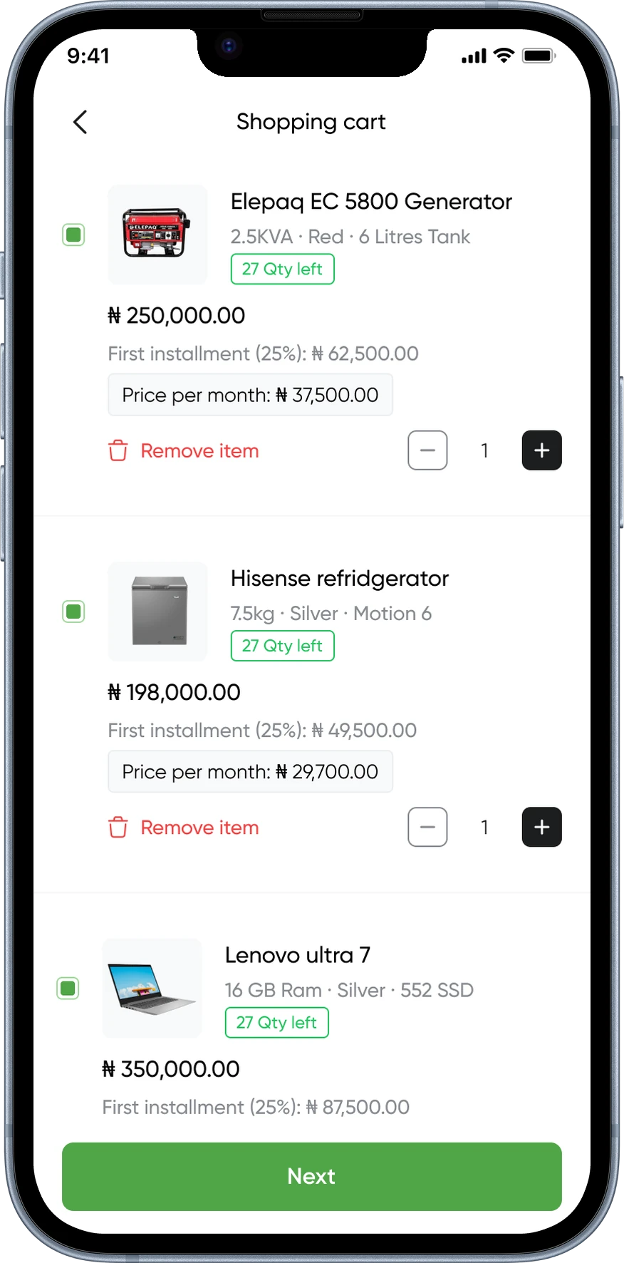
The original checkout had seven steps with no progress indicator and no cost summary until the end. We redesigned it as a four-stage flow: browse → select plan → review schedule → confirm.
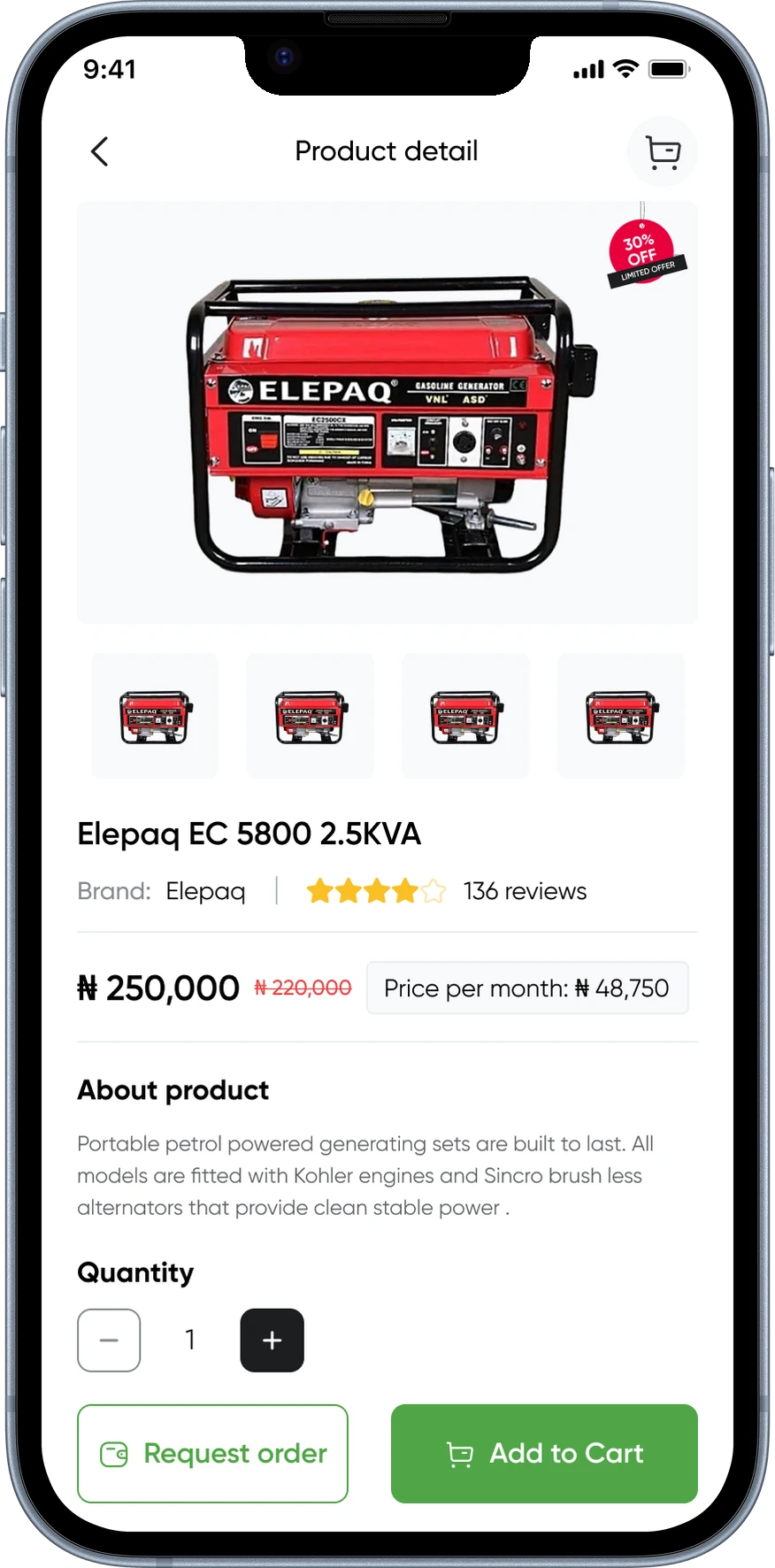
The key intervention was surfacing the monthly instalment and total repayment cost on the product page itself, before the user clicked anything. By the time someone reached the checkout, the financial commitment wasn’t a surprise. It was a confirmation.
We also added explicit trust signals at the payment entry screen: a plain-language explanation of how funds were held, a visible security badge, and a clear cancellation policy. These weren’t decorative, they were directly responding to what users told me they needed to feel safe.
The original checkout had seven steps with no progress indicator and no cost summary until the end. We redesigned it as a four-stage flow: browse → select plan → review schedule → confirm.
The key intervention was surfacing the monthly instalment and total repayment cost on the product page itself, before the user clicked anything. By the time someone reached the checkout, the financial commitment wasn’t a surprise. It was a confirmation.
We also added explicit trust signals at the payment entry screen: a plain-language explanation of how funds were held, a visible security badge, and a clear cancellation policy. These weren’t decorative, they were directly responding to what users told me they needed to feel safe.

💼 Integrated Financial Tools
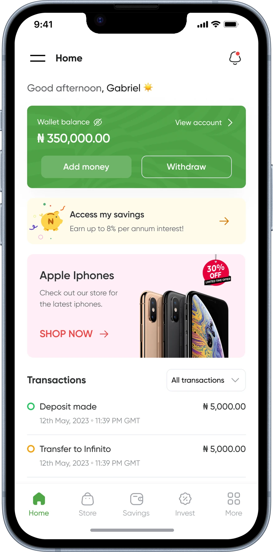
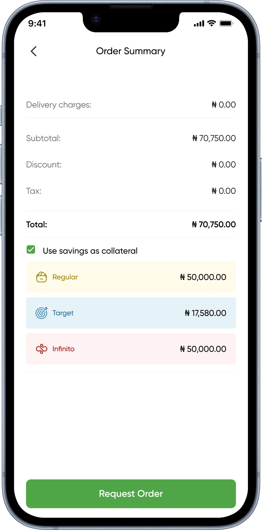
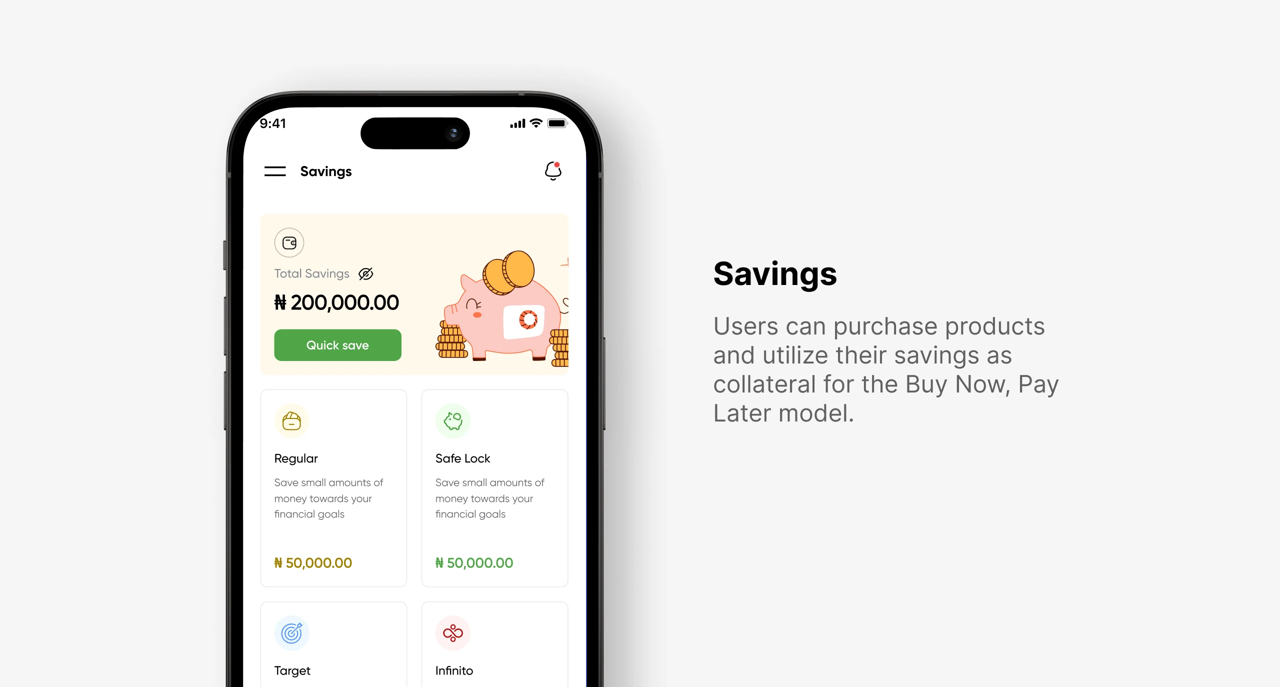
Rather than relegating savings to a side menu, we redesigned the information architecture to treat financial tools as a core part of the post-purchase experience.
After completing a BNPL order, users are offered the option to set up automatic savings toward their next instalment or use their current savings.
The framing shifted from ‘here’s a savings feature’ to ‘here’s how to make sure next month’s payment is ready without thinking about it.’ That reframe, from a product feature to a user benefit, came directly from what we heard in research.
Rather than relegating savings to a side menu, we redesigned the information architecture to treat financial tools as a core part of the post-purchase experience.
After completing a BNPL order, users are offered the option to set up automatic savings toward their next instalment or use their current savings.
The framing shifted from ‘here’s a savings feature’ to ‘here’s how to make sure next month’s payment is ready without thinking about it.’ That reframe, from a product feature to a user benefit, came directly from what we heard in research.

📐 Design Process
📐 Design Process
🧱 Component Library
🧱 Component Library
Midway through the project it became clear that the visual inconsistency across the platform wasn’t just a polish problem; it was a trust problem. Users read inconsistency as a signal that a product isn’t finished or isn’t serious.
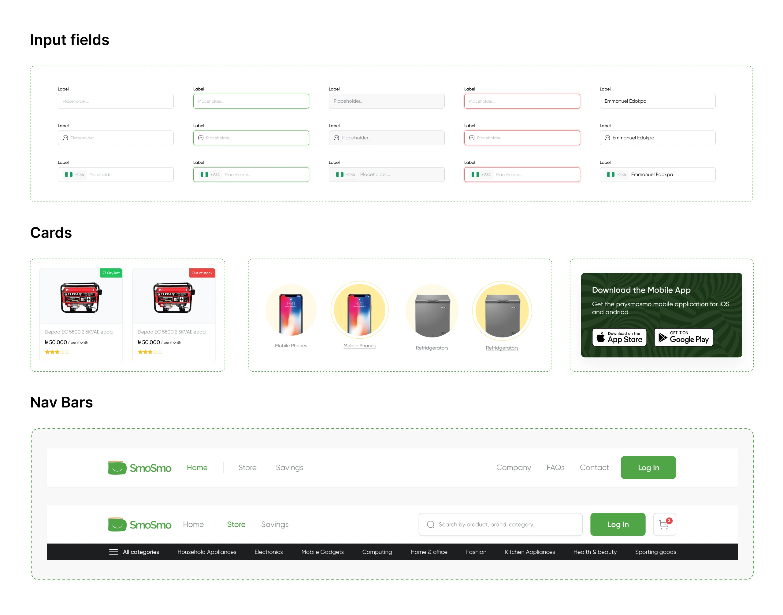
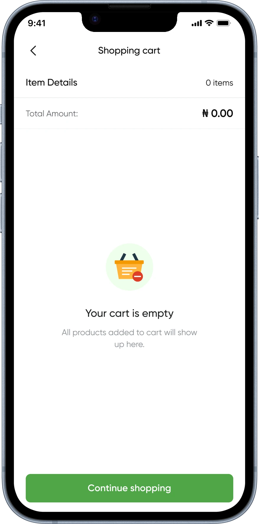
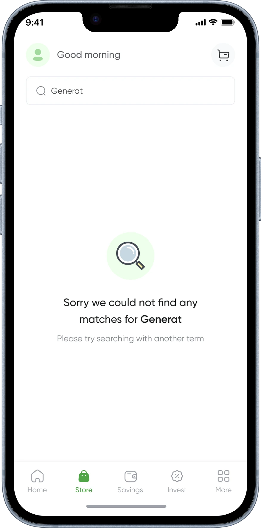
So we paused feature design for three days and built a component library from scratch: buttons, inputs, cards, navigation states, error messages, empty states, loading indicators, and the BNPL-specific plan selector component. This wasn’t overhead, it was what made the rest of the design cohesive and handoff-ready.
Midway through the project it became clear that the visual inconsistency across the platform wasn’t just a polish problem; it was a trust problem. Users read inconsistency as a signal that a product isn’t finished or isn’t serious.
So we paused feature design for three days and built a component library from scratch: buttons, inputs, cards, navigation states, error messages, empty states, loading indicators, and the BNPL-specific plan selector component. This wasn’t overhead, it was what made the rest of the design cohesive and handoff-ready.

🔁 Iterations
🔁 Iterations
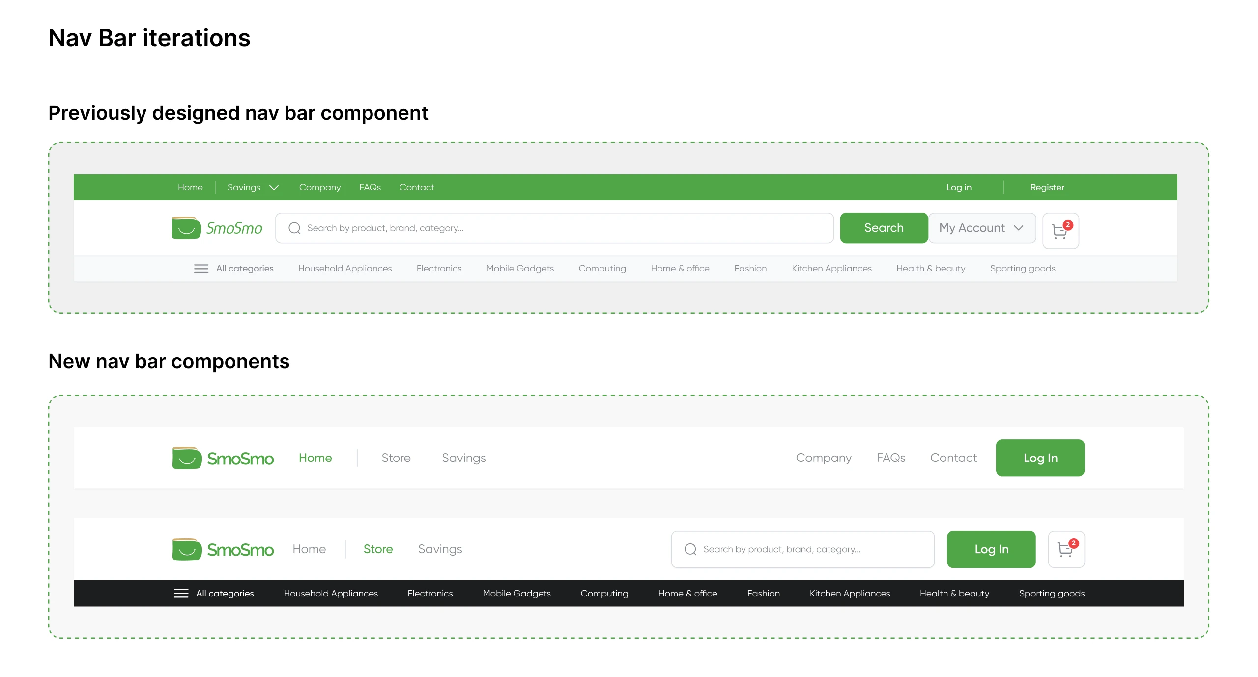
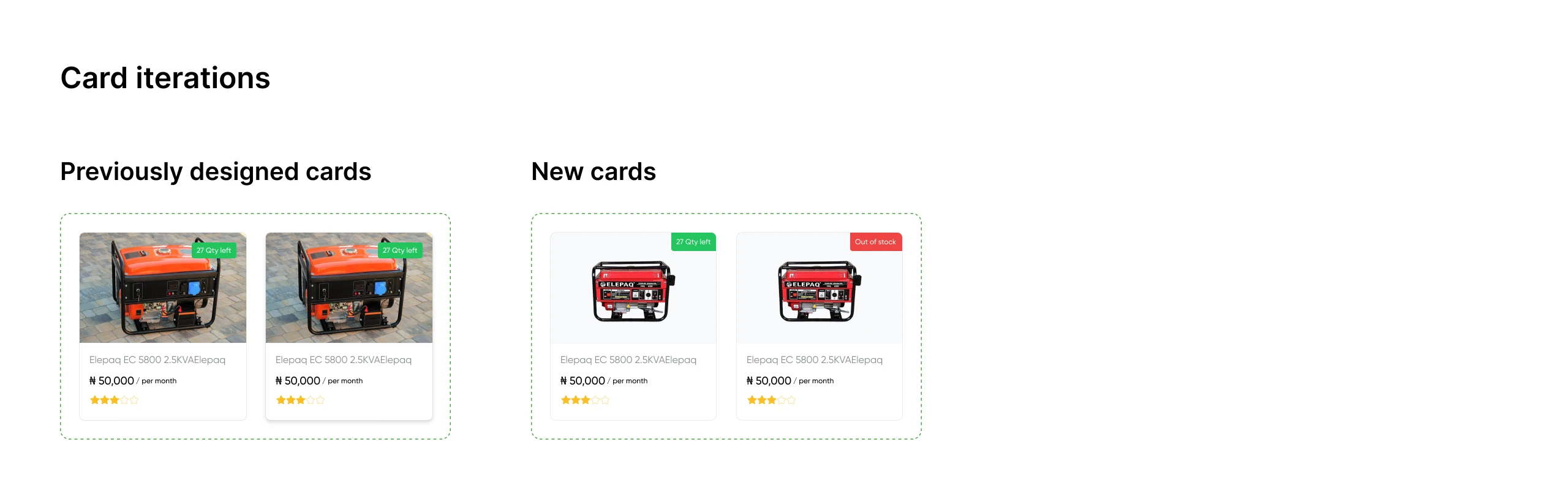
These are two of the key component iterations from the project, there were more across the 8 weeks, but the nav bar and product card show the clearest before-and-after thinking.


🎨 High-Fidelity Designs
🏠 Landing Pages
🏠 Landing Pages
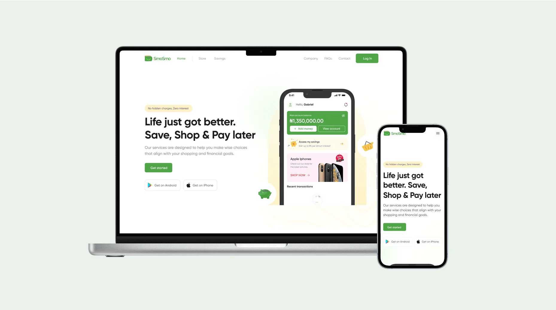
We created three distinct landing pages:
General Landing Page: Showcasing the full breadth of the product's offerings.
Savings Feature Page: Highlighting the intelligent savings tools.
Online Store Page: Focusing on the e-commerce aspect of the platform.
Created three distinct landing pages:
General Landing Page: Showcasing the full breadth of the product's offerings.
Savings Feature Page: Highlighting the intelligent savings tools.
Online Store Page: Focusing on the e-commerce aspect of the platform.

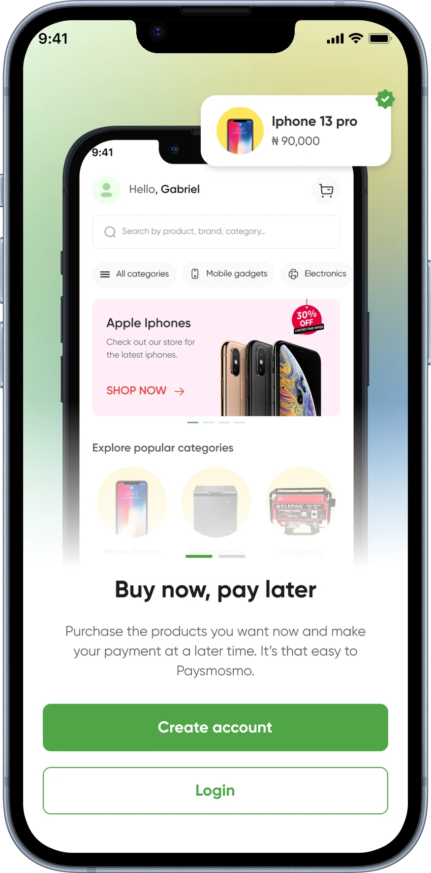
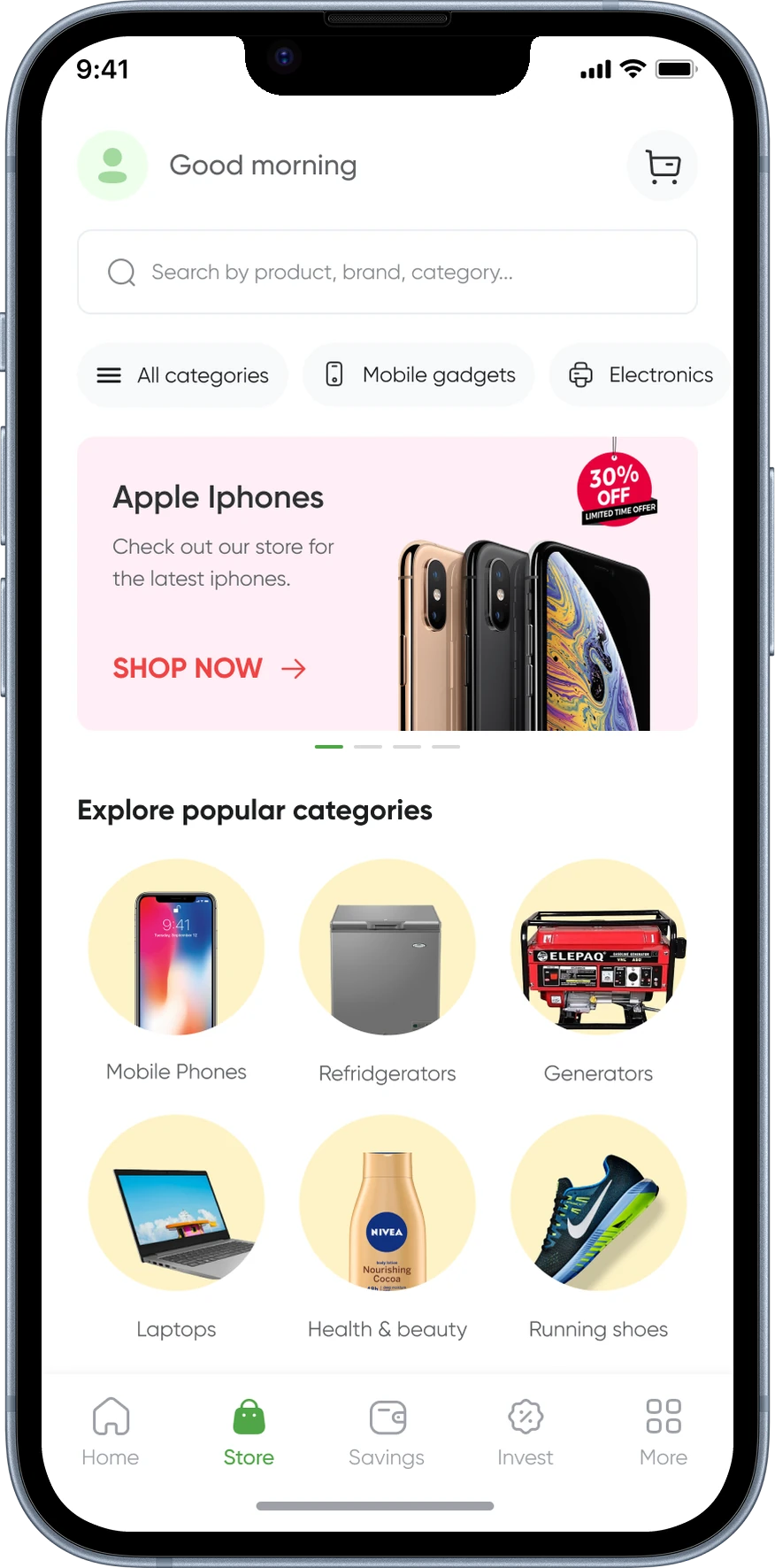
📱 Mobile Application
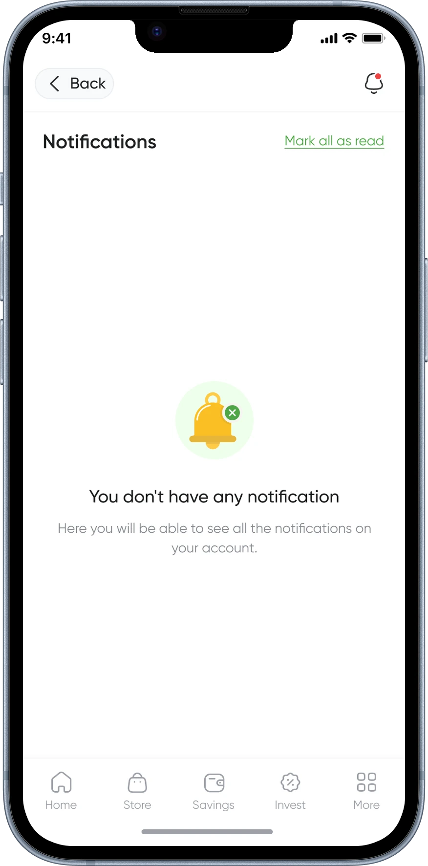
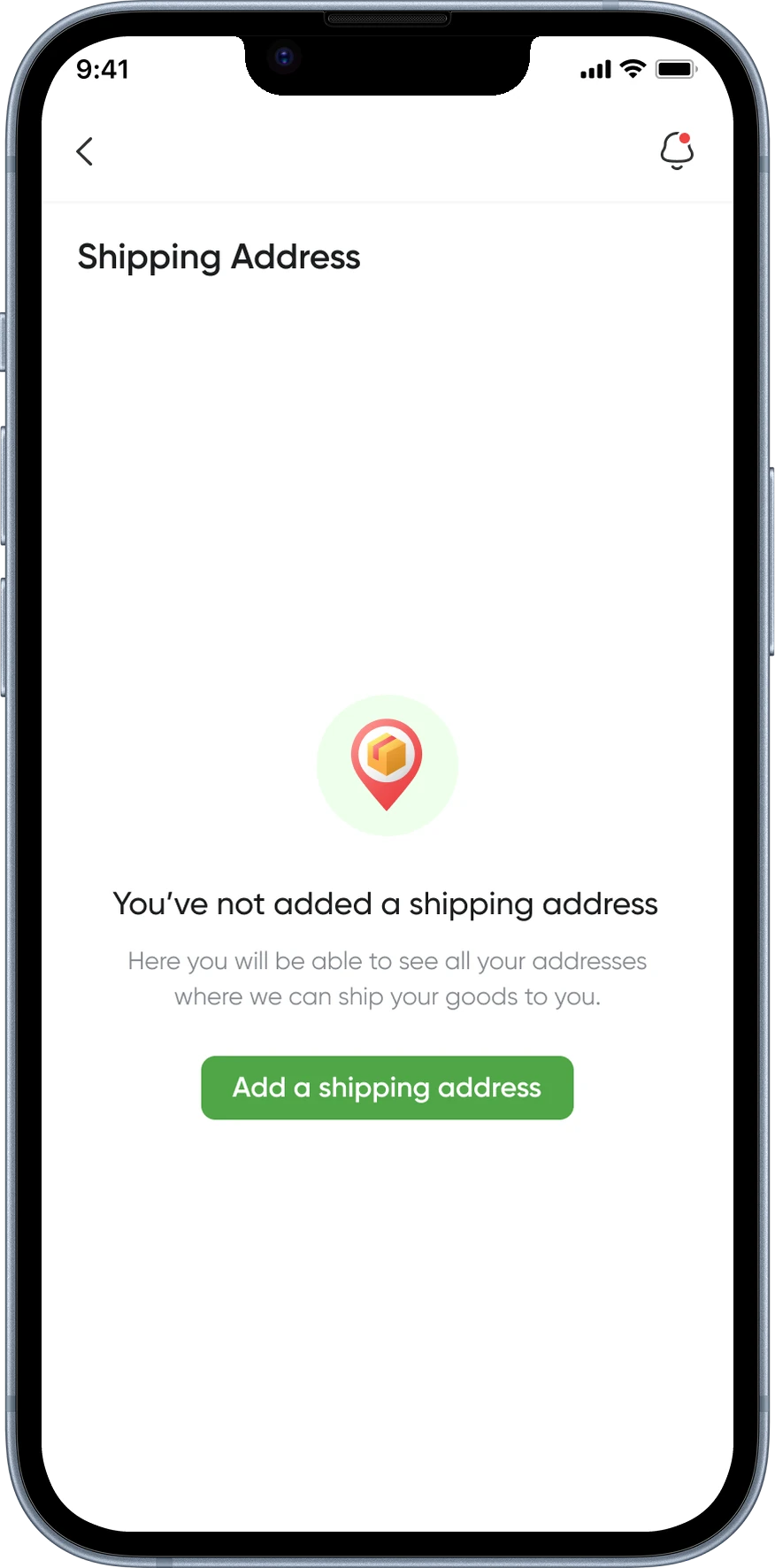
Developed a mobile application mirroring all functionalities of the web app, optimized for smaller screens to provide users with a seamless on-the-go experience


💔 The Part That Didn’t Happen
Eight weeks in, the designs were production-ready. The component library was documented. The prototype covered every core flow. The engineering team had been briefed and were already working on the product.
Then the client withdrew.
I won’t pretend that wasn’t frustrating. This was a product I believed in, solving a problem I’d spent weeks understanding properly.
But I also came away from it with something a launched product sometimes doesn’t give you: a very clear view of what I would have validated, what I would have measured, and what I would have gotten wrong.
Eight weeks in, the designs were production-ready. The component library was documented. The prototype covered every core flow. The engineering team had been briefed and were already working on the product.
Then the client withdrew.
I won’t pretend that wasn’t frustrating. This was a product I believed in, solving a problem I’d spent weeks understanding properly.
But I also came away from it with something a launched product sometimes doesn’t give you: a very clear view of what I would have validated, what I would have measured, and what I would have gotten wrong.
💬 What I learned regardless
Designing for financial trust is fundamentally different from designing for convenience.
With a food delivery app, a confusing UI is annoying. With a BNPL platform, it’s a reason to leave and never come back. That stakes difference shapes everything: how much text you include, where you put reassurance signals, and how explicit you are about costs.
I took that understanding into every financial product I’ve worked on since.
Designing for financial trust is fundamentally different from designing for convenience.
With a food delivery app, a confusing UI is annoying. With a BNPL platform, it’s a reason to leave and never come back. That stakes difference shapes everything: how much text you include, where you put reassurance signals, and how explicit you are about costs.
I took that understanding into every financial product I’ve worked on since.