Designing a safe, inclusive, and supportive resource hub for parents navigating new autism diagnoses (5 min read)
Designing a safe, inclusive, and supportive resource hub for parents navigating new autism diagnoses (5 min read)
Designing a safe, inclusive, and supportive resource hub for parents navigating new autism diagnoses (5 min read)
Web · Accessibility · Health Tech
Web · Accessibility · Health Tech
Spectrum.com
Spectrum.com
Spectrum.com
👋🏽 Project overview
👋🏽 Project overview
Spectrum is a digital resource hub for parents of children newly diagnosed with Autism Spectrum Disorder.
It provides curated educational content, a community forum, and an autism-trained conversational AI, all designed to be fully accessible to parents who themselves may have physical, visual, auditory, or cognitive impairments.
Spectrum is a digital resource hub for parents of children newly diagnosed with Autism Spectrum Disorder.
It provides curated educational content, a community forum, and an autism-trained conversational AI, all designed to be fully accessible to parents who themselves may have physical, visual, auditory, or cognitive impairments.
My Role
UI/UX Designer
UI/UX Designer
Research
Research
Accessibility modelling
Accessibility modelling
Persona creation
Persona creation
Visual design
Visual design
Usability testing
Usability testing
Prototype
Prototype
Platforms
Web (Responsive)
Web (Responsive)
Year
2024
2024
✅ The Challenge
✅ The Challenge
A new autism diagnosis changes everything for a family overnight. Parents suddenly need to understand medical terminology, navigate support systems, find therapists, connect with other families, and process their own emotional response, often all at once.
The internet is full of autism resources. The problem is how they’re built. Most are clinically dense, emotionally cold, and designed with a single type of user in mind: someone who is sighted, hearing, cognitively unimpaired, and using a mouse. That describes many parents but not all of them.
Parents of autistic children include people with visual impairments, physical disabilities, hearing loss, and cognitive differences like dyslexia. They are, by the nature of genetics and lived experience, a population with above-average accessibility needs. And almost no existing resource was built with them in mind.
Spectrum was designed to fix that, a resource hub that is emotionally supportive, clearly structured, and genuinely accessible to every parent who needs it, regardless of how they interact with the web.
A new autism diagnosis changes everything for a family overnight. Parents suddenly need to understand medical terminology, navigate support systems, find therapists, connect with other families, and process their own emotional response, often all at once.
The internet is full of autism resources. The problem is how they’re built. Most are clinically dense, emotionally cold, and designed with a single type of user in mind: someone who is sighted, hearing, cognitively unimpaired, and using a mouse. That describes many parents but not all of them.
Parents of autistic children include people with visual impairments, physical disabilities, hearing loss, and cognitive differences like dyslexia. They are, by the nature of genetics and lived experience, a population with above-average accessibility needs. And almost no existing resource was built with them in mind.
Spectrum was designed to fix that, a resource hub that is emotionally supportive, clearly structured, and genuinely accessible to every parent who needs it, regardless of how they interact with the web.
💻 My Role
💻 My Role
I was the sole designer on this project, responsible for every phase from initial research to final prototype and usability testing.
I was the sole designer on this project, responsible for every phase from initial research to final prototype and usability testing.
• Researched the medical and social models of disability, WCAG 2.2 accessibility guidelines, and the emotional experience of parents receiving a new autism diagnosis.
• Researched the medical and social models of disability, WCAG 2.2 accessibility guidelines, and the emotional experience of parents receiving a new autism diagnosis.
• Created four inclusive user personas, each a parent of a newly diagnosed autistic child, each with a distinct disability profile, and used them to drive every subsequent design decision.
• Created four inclusive user personas, each a parent of a newly diagnosed autistic child, each with a distinct disability profile, and used them to drive every subsequent design decision.
• Mapped empathy maps and user scenarios for each persona, identifying the specific barriers each would face on a standard website.
• Mapped empathy maps and user scenarios for each persona, identifying the specific barriers each would face on a standard website.
• Built paper wireframes for all core flows before moving to digital, ensuring structural decisions were made before visual ones.
• Built paper wireframes for all core flows before moving to digital, ensuring structural decisions were made before visual ones.
• Designed high-fidelity responsive screens in Figma across desktop, tablet, and mobile.
• Designed high-fidelity responsive screens in Figma across desktop, tablet, and mobile.
• Conducted usability testing against all four personas and used findings to iterate on navigation, content structure, and interaction feedback.
• Conducted usability testing against all four personas and used findings to iterate on navigation, content structure, and interaction feedback.
• Wrote all UX copy across the prototype, calibrated for reading level, emotional tone, and accessibility.
• Wrote all UX copy across the prototype, calibrated for reading level, emotional tone, and accessibility.
🧠 Research & Empathy
🧠 Research & Empathy
I approached this project with two parallel research tracks: understanding the users and understanding the standards.
I approached this project with two parallel research tracks: understanding the users and understanding the standards.
Understanding the users
I researched the emotional journey of parents receiving an autism diagnosis: the initial shock, the information overload, the search for community, and the gradual shift from crisis to management. A consistent finding: the moment parents most need clear, trustworthy information is also the moment they are least equipped to navigate complex, inaccessible websites.
I also researched the prevalence of disability among parents specifically. Autism has a significant genetic component, meaning parents of autistic children have higher-than-average rates of neurodevelopmental and sensory differences themselves. Designing for this audience without considering disability would mean failing a substantial portion of users from the start.
I researched the emotional journey of parents receiving an autism diagnosis: the initial shock, the information overload, the search for community, and the gradual shift from crisis to management. A consistent finding: the moment parents most need clear, trustworthy information is also the moment they are least equipped to navigate complex, inaccessible websites.
I also researched the prevalence of disability among parents specifically. Autism has a significant genetic component, meaning parents of autistic children have higher-than-average rates of neurodevelopmental and sensory differences themselves. Designing for this audience without considering disability would mean failing a substantial portion of users from the start.
Understanding the standards
I studied the Web Content Accessibility Guidelines (WCAG 2.2) in depth, focusing on the four core principles: Perceivable, Operable, Understandable, and Robust. I also researched assistive technologies: screen readers (NVDA, VoiceOver), keyboard-only navigation, caption systems, and Braille displays to understand how real users would interact with the design.
Rather than treating WCAG compliance as a checklist, I used it as a design lens: what does this screen feel like if you cannot see it? What does this navigation feel like if you cannot use a mouse? What does this paragraph feel like if you process text slowly?
I studied the Web Content Accessibility Guidelines (WCAG 2.2) in depth, focusing on the four core principles: Perceivable, Operable, Understandable, and Robust. I also researched assistive technologies: screen readers (NVDA, VoiceOver), keyboard-only navigation, caption systems, and Braille displays to understand how real users would interact with the design.
Rather than treating WCAG compliance as a checklist, I used it as a design lens: what does this screen feel like if you cannot see it? What does this navigation feel like if you cannot use a mouse? What does this paragraph feel like if you process text slowly?
The two models of disability
I grounded the research in the distinction between the medical model of disability (which locates the problem in the individual) and the social model (which locates the problem in the environment).
Spectrum was built on the social model: David, Sophia, Liam, and Emily are not limited by their impairments. They are limited by websites that weren’t built for them. Spectrum's job was to stop being that website.
I grounded the research in the distinction between the medical model of disability (which locates the problem in the individual) and the social model (which locates the problem in the environment).
Spectrum was built on the social model: David, Sophia, Liam, and Emily are not limited by their impairments. They are limited by websites that weren’t built for them. Spectrum's job was to stop being that website.
🛠️ Problem Statement
🛠️ Problem Statement
How might we design a fully accessible and emotionally supportive digital platform that helps parents of autistic children find resources, community, and guidance?
How might we design a fully accessible and emotionally supportive digital platform that helps parents of autistic children find resources, community, and guidance?
🎯 Target Users
🎯 Target Users
I developed four personas, each a parent of a child newly diagnosed with ASD, each with a distinct disability profile. These weren’t decorative; every design decision in the project was tested against at least one of them.
I developed four personas, each a parent of a child newly diagnosed with ASD, each with a distinct disability profile. These weren’t decorative; every design decision in the project was tested against at least one of them.
• David — Physical impairment (spinal cord injury)
Uses a keyboard exclusively, no mouse. Needs full keyboard navigation, visible focus indicators, and large click/tap targets. His biggest frustration with existing sites: menus that trap focus and interactive elements that can’t be reached without a pointer.
Uses a keyboard exclusively, no mouse. Needs full keyboard navigation, visible focus indicators, and large click/tap targets. His biggest frustration with existing sites: menus that trap focus and interactive elements that can’t be reached without a pointer.
• Sophia — Legally blind
Relies on a screen reader (VoiceOver) and a braille display. Needs proper semantic HTML, meaningful alt text on every image, logical heading structure, and audio descriptions for video content. A page that looks beautiful but has no alt text is, to Sophia, an empty page.
Relies on a screen reader (VoiceOver) and a braille display. Needs proper semantic HTML, meaningful alt text on every image, logical heading structure, and audio descriptions for video content. A page that looks beautiful but has no alt text is, to Sophia, an empty page.
• Liam — Hard of hearing
Communicates primarily through sign language and relies on captions for all video and audio content. Needs BSL (British Sign Language) interpretation for video content and visible, synchronised captions. Audio-only information is invisible to him.
Communicates primarily through sign language and relies on captions for all video and audio content. Needs BSL (British Sign Language) interpretation for video content and visible, synchronised captions. Audio-only information is invisible to him.
• Emily — Dyslexia
Processes dense text slowly and benefits from clean typography, generous line spacing, short paragraphs, descriptive headings, and the option to listen rather than read. A wall of justified text in a small serif font is one of the most hostile things a designer can put in front of her.
Processes dense text slowly and benefits from clean typography, generous line spacing, short paragraphs, descriptive headings, and the option to listen rather than read. A wall of justified text in a small serif font is one of the most hostile things a designer can put in front of her.
Designing for all four simultaneously forced genuine prioritisation. When a decision served all four, clear heading structure, consistent navigation, plain language, it stayed. When it served one at the expense of another, I found a solution that worked for both.
Designing for all four simultaneously forced genuine prioritisation. When a decision served all four, clear heading structure, consistent navigation, plain language, it stayed. When it served one at the expense of another, I found a solution that worked for both.
🧩 Key Features & Design Highlights
🧩 Key Features & Design Highlights
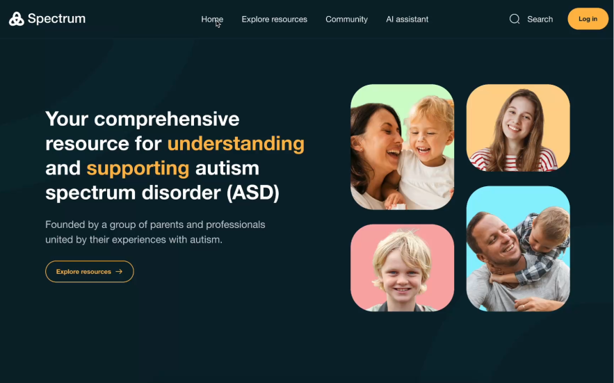
🏠 Accessible Homepage with Structured Navigation
The homepage was designed around a single principle: a parent in distress should be able to find what they need in under three clicks, regardless of how they’re navigating. The information architecture was built around the four primary jobs a parent needs to do: learn about autism, find support resources, connect with other parents, and get personalised guidance.
Navigation labels are plain-language, keyboard-accessible, and announced correctly by screen readers. The visual hierarchy uses contrast ratios that meet AAA standards throughout.
The homepage was designed around a single principle: a parent in distress should be able to find what they need in under three clicks, regardless of how they’re navigating. The information architecture was built around the four primary jobs a parent needs to do: learn about autism, find support resources, connect with other parents, and get personalised guidance.
Navigation labels are plain-language, keyboard-accessible, and announced correctly by screen readers. The visual hierarchy uses contrast ratios that meet AAA standards throughout.
📚 Explore Resources with Filters & Categories
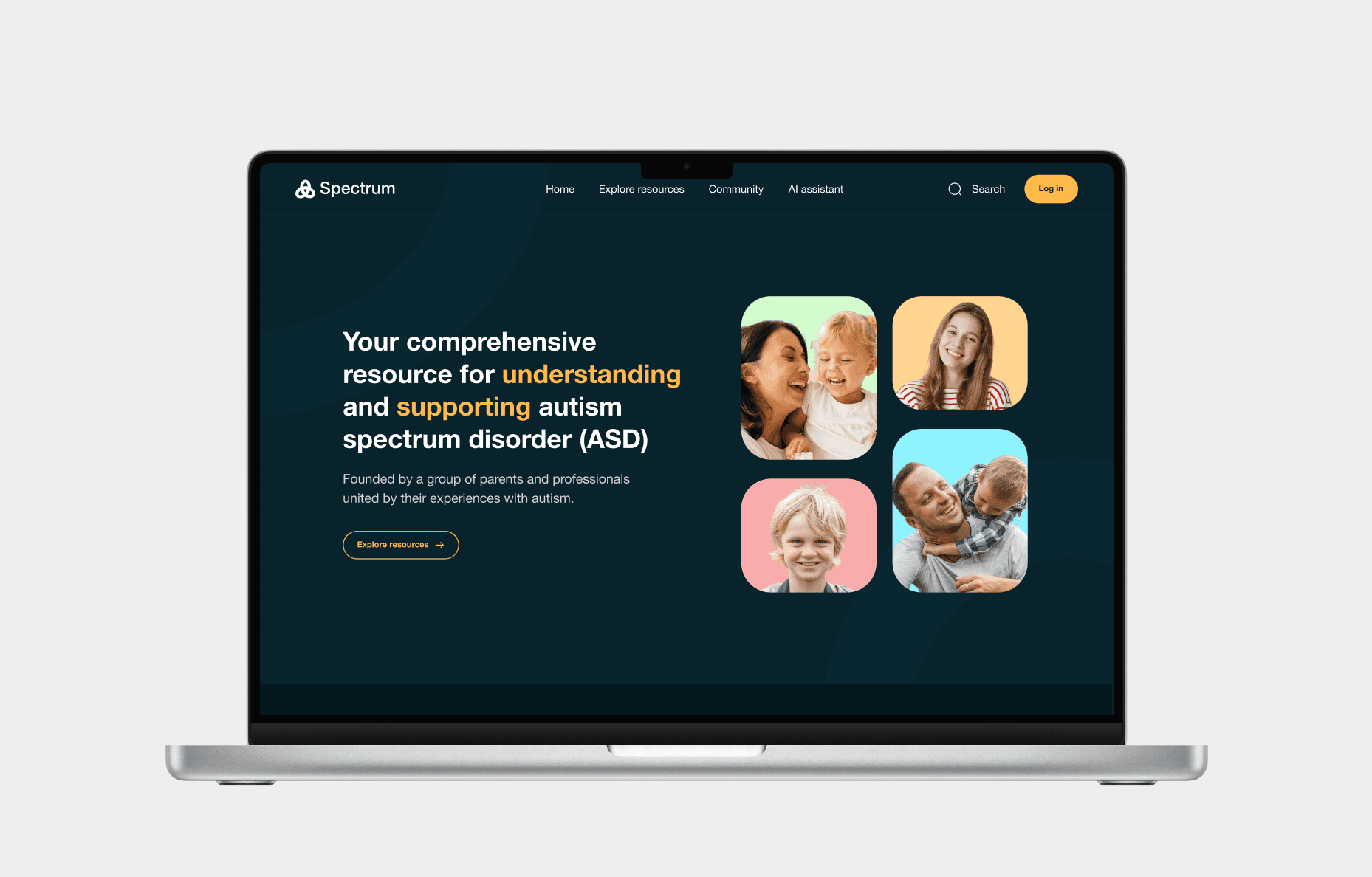
Parents arrive at Spectrum at very different points in their journey, some days after a diagnosis, some months in. The resources section uses filters by topic, format (article, video, audio), and reading level, so users can find content appropriate to where they are.
For Emily, the format filter was specifically designed to surface audio content prominently. For Sophia, every resource card has a full-text alternative and is navigable by screen reader in a logical order.
Parents arrive at Spectrum at very different points in their journey, some days after a diagnosis, some months in. The resources section uses filters by topic, format (article, video, audio), and reading level, so users can find content appropriate to where they are.
For Emily, the format filter was specifically designed to surface audio content prominently. For Sophia, every resource card has a full-text alternative and is navigable by screen reader in a logical order.

💬 Community Forum
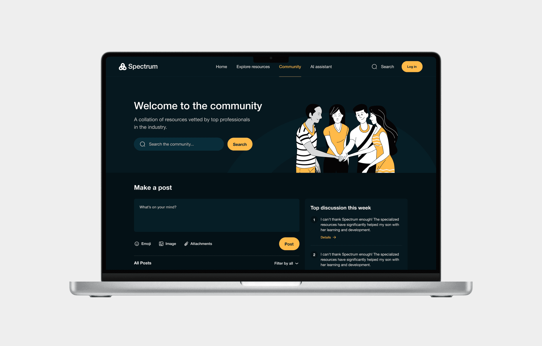
Isolation is one of the most commonly reported experiences among parents of autistic children, particularly in the early months after a diagnosis. The community forum provides a moderated, safe space to share experiences, ask questions, and offer support.
Posts are anonymous by default to reduce the barrier of vulnerability. For Liam, all forum notification sounds have visible alternatives. For David, the post composer and all interactive forum elements are fully keyboard-operable.
Isolation is one of the most commonly reported experiences among parents of autistic children, particularly in the early months after a diagnosis. The community forum provides a moderated, safe space to share experiences, ask questions, and offer support.
Posts are anonymous by default to reduce the barrier of vulnerability. For Liam, all forum notification sounds have visible alternatives. For David, the post composer and all interactive forum elements are fully keyboard-operable.
🤖 Autism-Trained Conversational AI
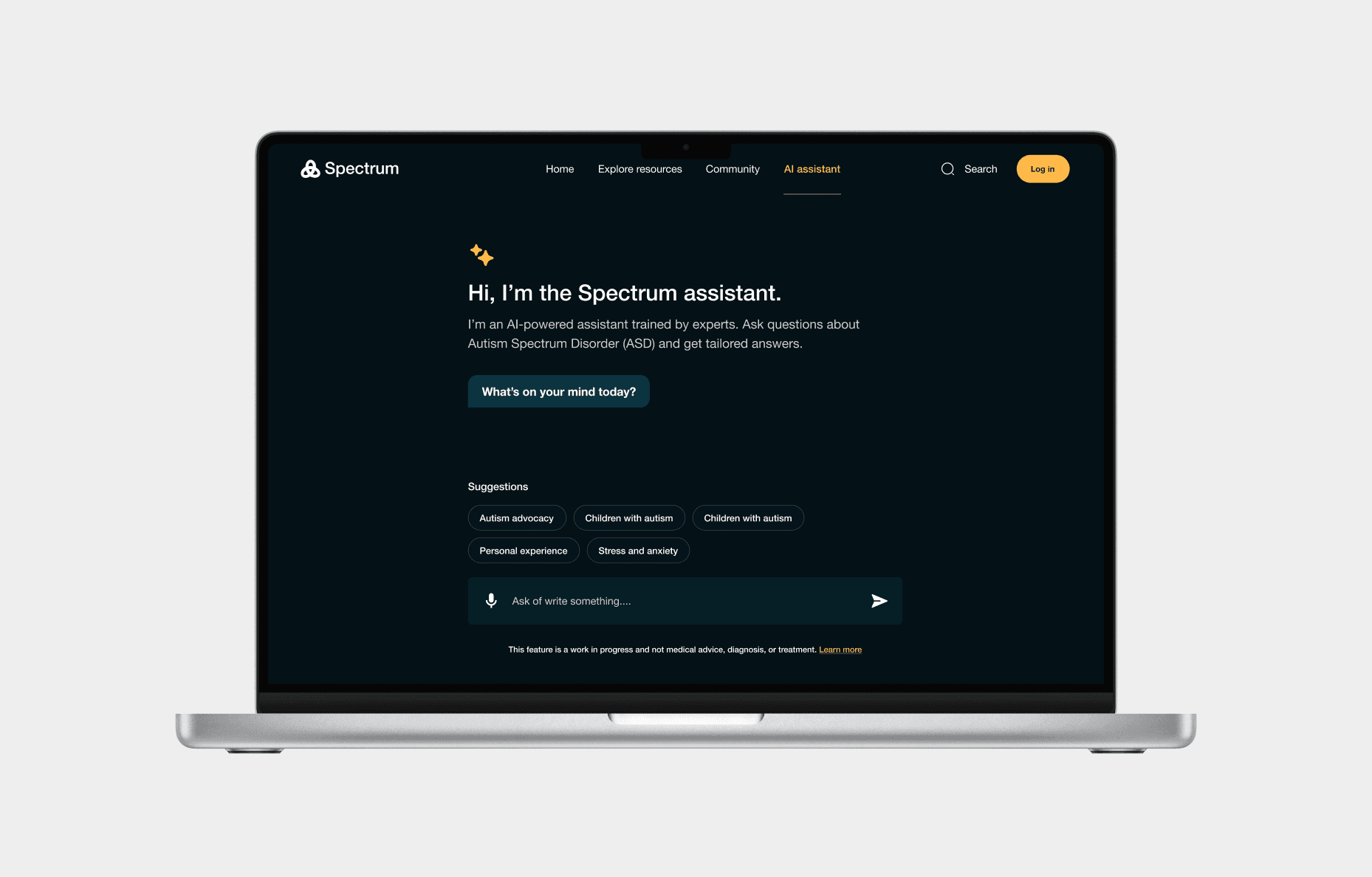
Parents often have questions they’re not sure how to phrase or that feel too small to bring to a professional. The conversational AI provides a private, patient, always-available space for those questions, trained on autism-specific resources rather than general knowledge.
The chat interface was designed with Sophia’s screen reader in mind: every message is announced in order, input fields are properly labelled, and the send button has a keyboard shortcut.
Parents often have questions they’re not sure how to phrase or that feel too small to bring to a professional. The conversational AI provides a private, patient, always-available space for those questions, trained on autism-specific resources rather than general knowledge.
The chat interface was designed with Sophia’s screen reader in mind: every message is announced in order, input fields are properly labelled, and the send button has a keyboard shortcut.
🎨 Inclusive UI Design
Visual design decisions were made with accessibility as the primary constraint, not an afterthought. Colour contrast ratios exceed WCAG AA throughout, with key areas meeting AAA.
Typography uses a dyslexia-friendly sans-serif with generous line height and a maximum line length of 75 characters. Interactive states, hover, focus, active, and error are distinct and communicated through both colour and shape, never colour alone.
Visual design decisions were made with accessibility as the primary constraint, not an afterthought. Colour contrast ratios exceed WCAG AA throughout, with key areas meeting AAA.
Typography uses a dyslexia-friendly sans-serif with generous line height and a maximum line length of 75 characters. Interactive states, hover, focus, active, and error are distinct and communicated through both colour and shape, never colour alone.
♿ Inclusive by Design: Accessibility Standards Met
♿ Inclusive by Design: Accessibility Standards Met
Each persona set a different accessibility target. Meeting all four simultaneously meant the design had to work across the full range of assistive technologies and interaction models, not just the most common ones.
Each persona set a different accessibility target. Meeting all four simultaneously meant the design had to work across the full range of assistive technologies and interaction models, not just the most common ones.

Physical
AAA
David
Full keyboard navigation, focus indicators
Visual
AA
Sophia
Audio descriptions, screen reader support

Hearing
AAA
Liam
Captions + sign language for videos
Cognitive
AA/AAA
Emily
Text spacing, color contrast, descriptive headers
📱 Multi-Device Support
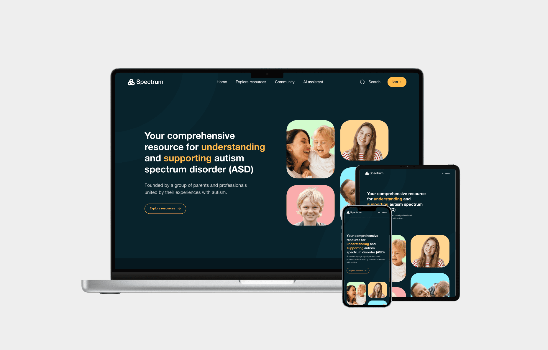
Spectrum was designed responsively across three breakpoints: desktop (1440px), tablet (768px), and mobile (375px).
Accessibility requirements were maintained at all sizes; tap targets meet the 44x44px minimum on mobile, navigation collapses to a keyboard-accessible hamburger menu, and content reflows without horizontal scrolling at any viewport width.
Spectrum was designed responsively across three breakpoints: desktop (1440px), tablet (768px), and mobile (375px).
Accessibility requirements were maintained at all sizes; tap targets meet the 44x44px minimum on mobile, navigation collapses to a keyboard-accessible hamburger menu, and content reflows without horizontal scrolling at any viewport width.
💡 What I Learned
💡 What I Learned
• Accessibility is not an add-on , it must be baked into UX from the start
• Accessibility is not an add-on , it must be baked into UX from the start
Every time I tried to retrofit an accessibility fix onto an existing design decision, it was harder and less effective than if I’d made it accessible from the beginning. Accessible design starts at the information architecture level, not the colour contrast check at the end.
Every time I tried to retrofit an accessibility fix onto an existing design decision, it was harder and less effective than if I’d made it accessible from the beginning. Accessible design starts at the information architecture level, not the colour contrast check at the end.
• Users with impairments want independence, not sympathy
• Users with impairments want independence, not sympathy
None of my four personas wanted a simplified experience. They wanted the same depth of content and functionality as any other user, just delivered in a way their assistive technology could handle. The goal was equivalence, not reduction.
None of my four personas wanted a simplified experience. They wanted the same depth of content and functionality as any other user, just delivered in a way their assistive technology could handle. The goal was equivalence, not reduction.
• Emotional design and assistive technology can and should coexist
• Emotional design and assistive technology can and should coexist
There’s a misconception that accessible design is necessarily plain or clinical. Spectrum proved the opposite: warm illustration, thoughtful copy, and a considered colour palette are entirely compatible with screen reader support, keyboard navigation, and WCAG compliance.
There’s a misconception that accessible design is necessarily plain or clinical. Spectrum proved the opposite: warm illustration, thoughtful copy, and a considered colour palette are entirely compatible with screen reader support, keyboard navigation, and WCAG compliance.
• A parent in distress needs tools that feel clear, warm, and empowering
• A parent in distress needs tools that feel clear, warm, and empowering
The emotional register of the design matters as much as the functionality. Parents arriving at Spectrum are often scared and overwhelmed. Every copy decision, every visual choice, and every interaction was tested against one question: does this feel like help, or does it feel like more to deal with?
The emotional register of the design matters as much as the functionality. Parents arriving at Spectrum are often scared and overwhelmed. Every copy decision, every visual choice, and every interaction was tested against one question: does this feel like help, or does it feel like more to deal with?
• Designing for extremes improves design for everyone
• Designing for extremes improves design for everyone
Every decision I made for David, Sophia, Liam, or Emily made the experience better for users without those specific needs too. Clearer headings, better contrast, shorter paragraphs, and consistent navigation are things every user benefits from.
Every decision I made for David, Sophia, Liam, or Emily made the experience better for users without those specific needs too. Clearer headings, better contrast, shorter paragraphs, and consistent navigation are things every user benefits from.