Fintech · Mobile app · Enyata
Jollof+
A savings and investment app for Baobab Microfinance Bank.
In 2023, Baobab Microfinance Bank approached Enyata with an ambitious mission: "Can we help Nigerians stay ahead of the inflation curve by giving competitive interest on savings and investments?" They had the vision, the reach and the data. But they needed a digital experience that spoke the language of trust, simplicity and everyday life. That's where I came in.
The problem
During our research we identified four primary problems with the digital saving culture in Nigeria.
Trust issues
Many users are wary of saving apps. "What if my money disappears overnight?"
Inconsistent income
It's hard to set a monthly goal when your income isn't steady or doesn't arrive on set days.
Overwhelming interfaces
Most fintech apps are built for people with stable salaries and financial knowledge. We had to start simpler.
Low incentives
Many users ask, "What's in it for me?" And rightly so. Baobab prioritised high interest rates as a key part of the value proposition, giving users a compelling reason to start and keep saving, with visible returns that reinforced trust.
How might we help Nigerians save money in a way that feels safe, easy and made for their everyday lives?
Research and discovery
Before sketching a single screen, we needed to understand how Nigerians actually think about saving money, especially those with irregular incomes.
- User interviews with 20+ people across Lagos, Abuja and Ibadan, covering traders, gig workers and salaried employees.
- A competitive audit of savings apps including PiggyVest, Cowrywise and Kuda, to understand patterns, friction points and trust signals.
- Two core user journeys: a first-time saver, and a returning user managing several savings goals.
- Stakeholder workshops with the Baobab team to align on business constraints, compliance requirements and interest rate positioning.
Users didn't distrust saving, they distrusted apps. The barrier wasn't motivation; it was credibility.
This insight shaped every design decision that followed, from the onboarding flow to the way we displayed interest rates.
The solution
We didn't set out to build just another savings app. We wanted to create something that felt trustworthy, flexible and truly Nigerian, built for the way people actually live and earn.
01
Trust first
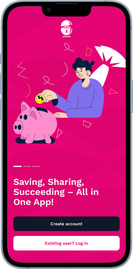
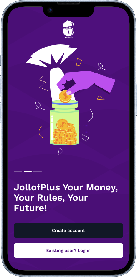
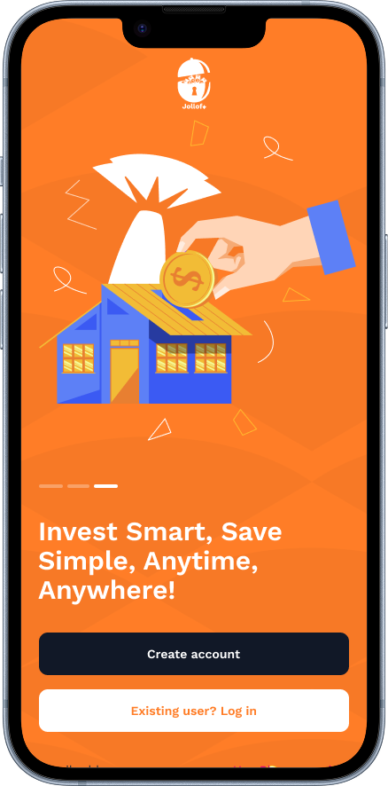
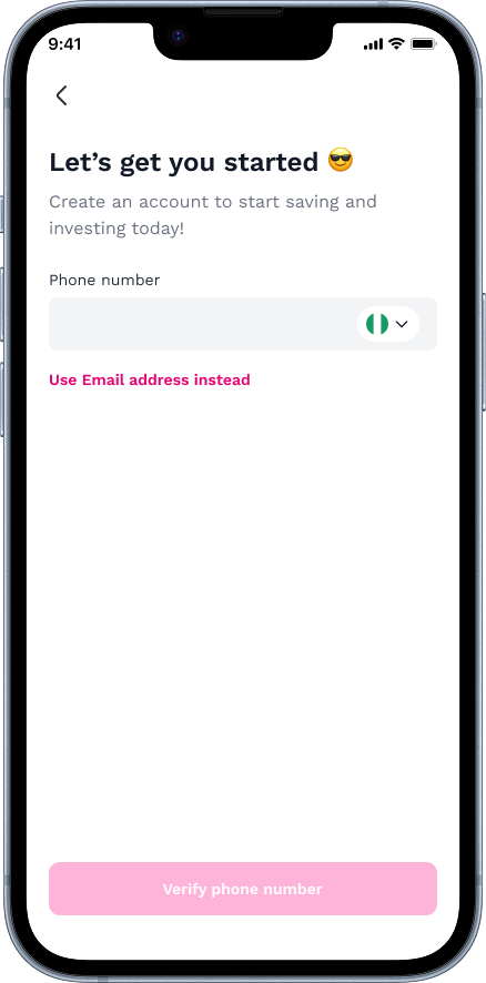
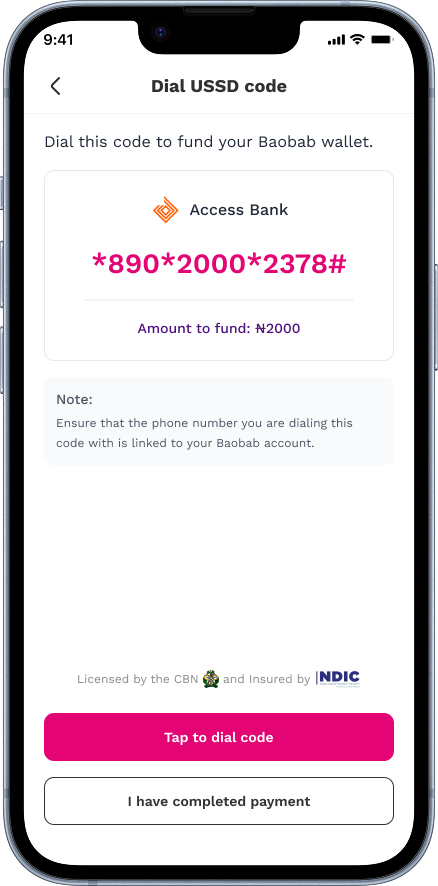
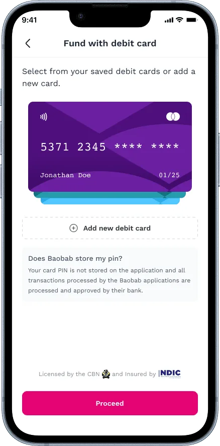
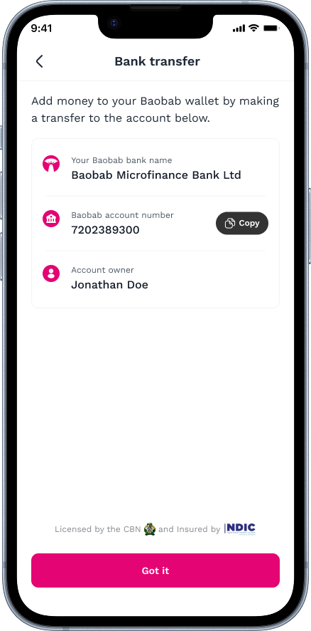
We led the onboarding with Baobab's NDIC insurance badge, CBN licensing details and a plain-language explanation of how funds are protected. By addressing trust before asking for a single naira, we reduced drop-off at the most critical stage of the funnel.
02
Real value, upfront
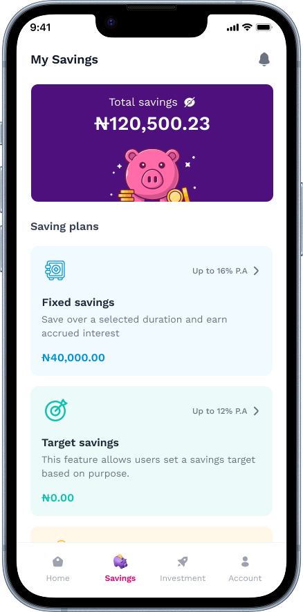
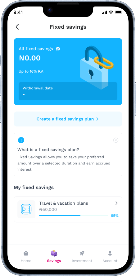
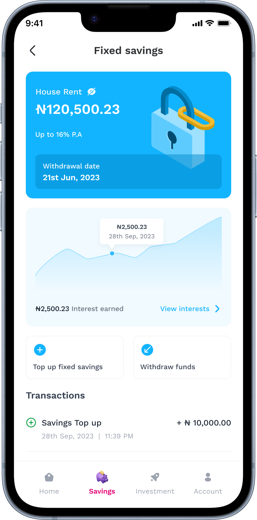
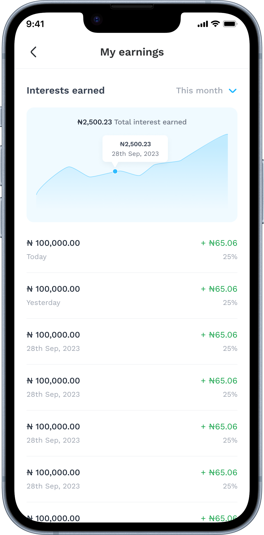
Interest rates were displayed prominently on the home screen, not buried in a product details page. Large, high-contrast typography made the returns feel real and tangible, giving users an immediate answer to "what's in it for me?"
03
Built for irregular incomes
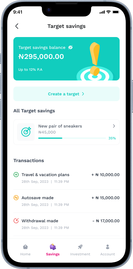
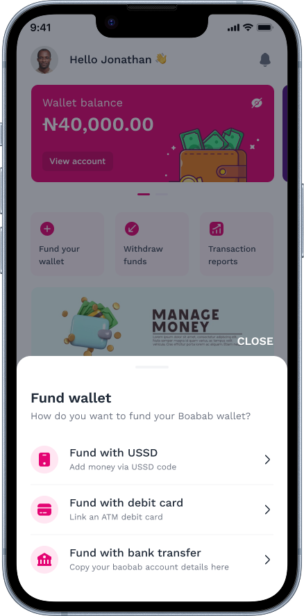
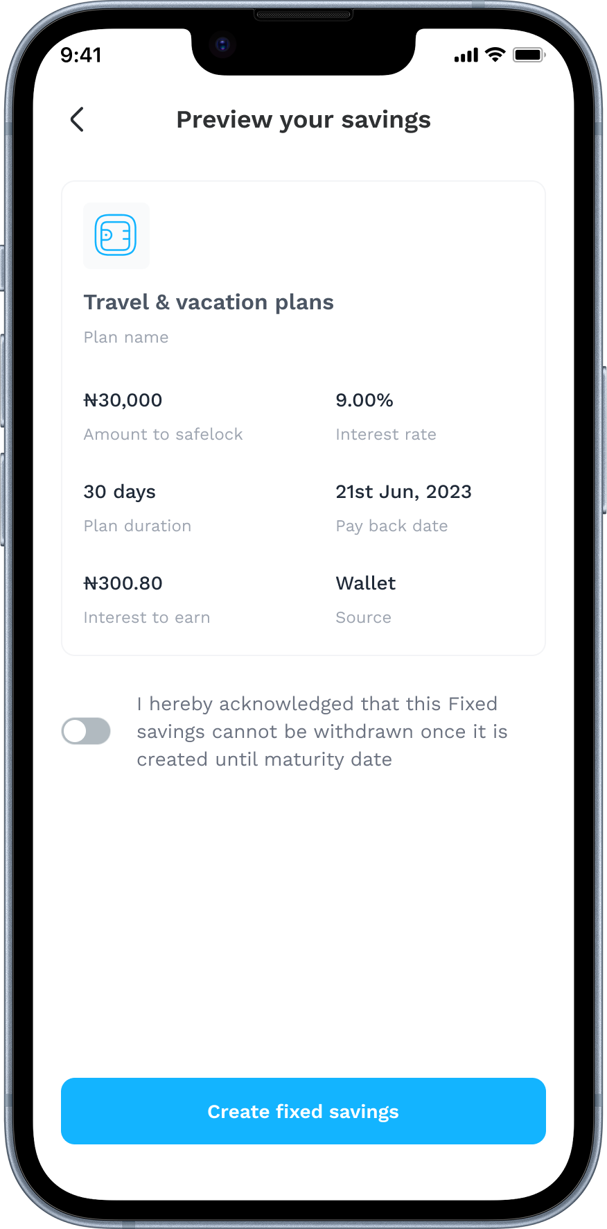
Rather than enforcing fixed monthly contributions, we designed a flexible model that lets users save any amount, at any time. The goal-setting flow uses a target amount instead of a monthly figure, which resonated far better with traders and freelancers.
04
Simple, encouraging design
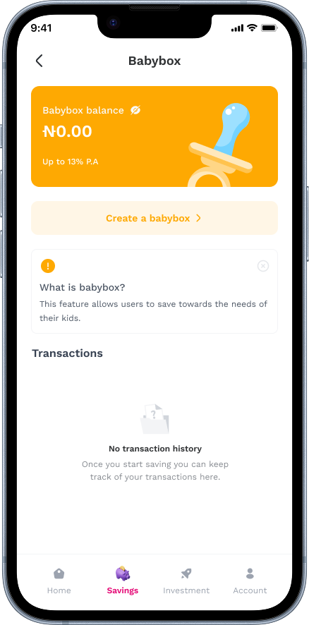
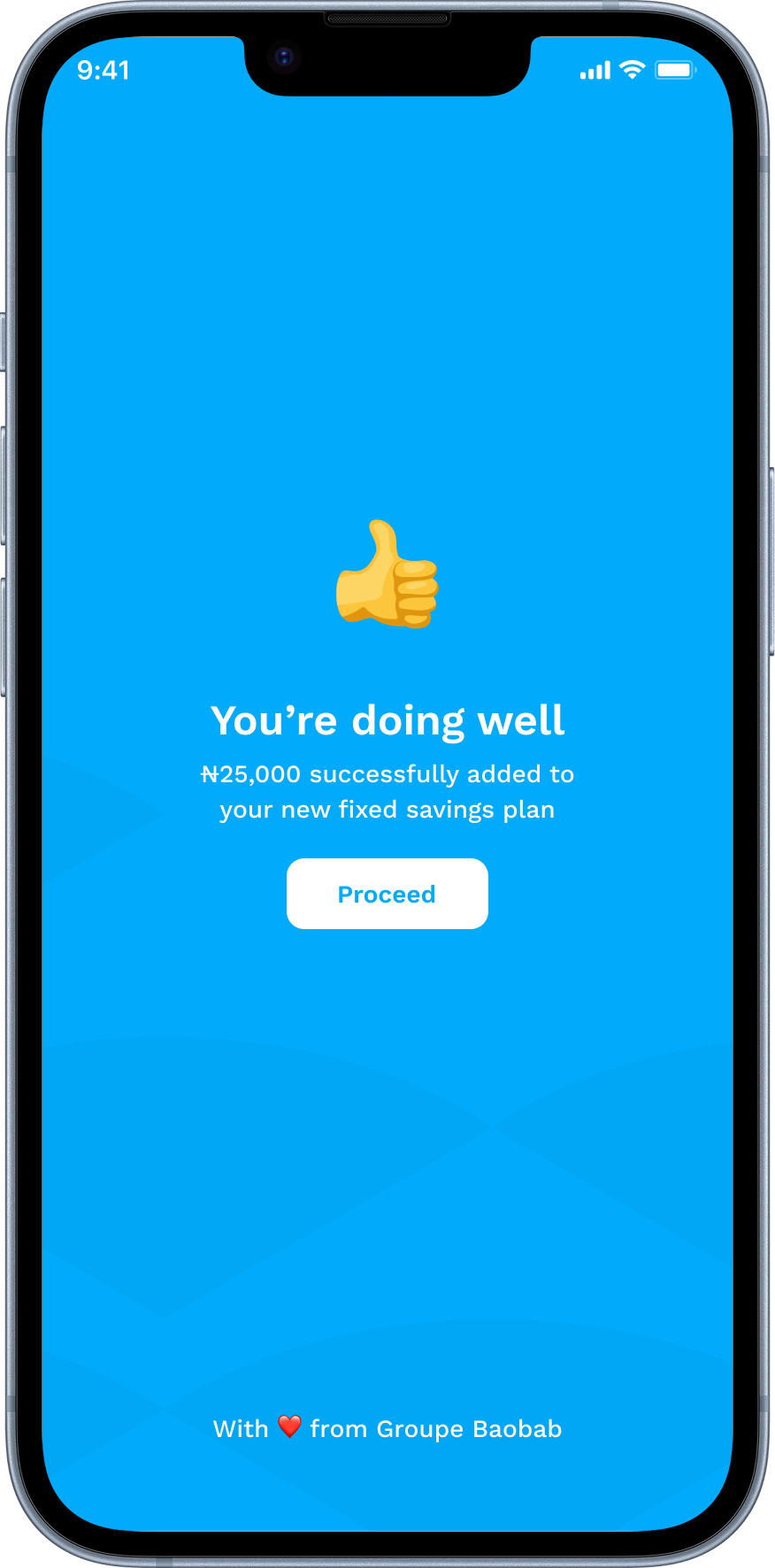
We kept the interface clean and easy, with big buttons and one clear action at a time. Progress bars filled up as people saved, and milestones were celebrated with thoughtful messages like "You're doing well!" Nothing flashy.
The results
This wasn't just about launching an app. It was about proving that design, done right, can drive real change.
- 15,500+Users downloaded the app
- ₦1.4BSaved within 64 days of launch
- 95%Usability success rate on core tasks
- 12 weeksTo MVP
Featured in Nairametrics, TechCabal and BusinessDay.
Designing for both sides
While the user-facing app was my primary focus, I also owned the design of the internal admin dashboard used daily by Baobab's operations team.
The team needed to monitor savings activity in real time, manage accounts, approve withdrawals and track interest disbursements, all without a dedicated engineering resource for bespoke tooling. I designed a clean, role-based dashboard with four core modules:
- Account management: view, verify and flag accounts, with full KYC status visibility.
- Savings overview: a real-time breakdown of active plans, total funds under management and plan types.
- Interest disbursement: a queue for reviewing and approving scheduled payouts, with audit logs.
- Reporting: exportable summaries for weekly ops reviews and regulatory reporting.
The guiding principle was the same as the consumer app: reduce cognitive load. Every screen answered one clear question, so the team could act quickly and confidently.
Challenges, and what I'd do differently
Every project has its friction, and Jollof+ was no different.
- 01
Timeline pressure
Delivering a production-ready MVP in 12 weeks meant hard calls on scope. A referral programme and a savings streak tracker were deprioritised to protect launch quality. I'd have pushed earlier for a phased roadmap to set clearer expectations from the start.
- 02
Accessibility gaps
I'd invest more time in low-vision and screen-reader testing. Our usability sessions focused on task completion, but didn't include people using assistive technology, a gap I want to close in future fintech work.
Want to talk about this project? I'd genuinely like to hear from you.