Health tech · Mobile app · MSc UX
Clink
Helping young people take control of their drinking with support, data and compassion.
Clink is an alcohol management app for young people who are ready to change their relationship with alcohol, but need more than a drink log to do it. Built during my MSc in User Experience Design at Birmingham City University, it brings sobriety tracking, conversational AI, anonymous community support and therapist access into one compassionate experience.
The challenge
- 10.4MPeople in the UK drinking at increasing or high-risk levels
- 602,391Estimated dependent drinkers in England
- 82%Of them not receiving any treatment
The barriers aren't just practical. Stigma makes people afraid to ask for help. Depression, anxiety and trauma often co-exist with alcohol dependency, each making the other worse. And the apps that existed were passive: log your drinks, see a calendar, get a reminder. They tracked the problem without addressing the person behind it.
Our brief was to design something better: a digital solution that meets young people where they are, reduces the friction of seeking help, and supports them through the whole journey, not just on their best days.
How might we help young people in the UK reduce or stop drinking in a way that feels safe and non-judgemental, addresses the emotional and social barriers to seeking help, and supports them through good days and relapses?
My responsibilities
As one of four UX designers, I contributed across the whole project:
- Led the competitive analysis of Sober Sidekick, NHS Drink Free Days and Try Dry January, finding gaps in progress tracking, moderation tools and community safety.
- Ran and synthesised survey research with 11 respondents. 9 in 10 didn't use any app to manage their drinking, and health was the main reason for wanting to change.
- Co-created four personas, including two with disabilities (paraplegia and visual impairment), so the design was inclusive from the start.
- Built empathy maps, an information architecture, user journey diagrams and a full journey map.
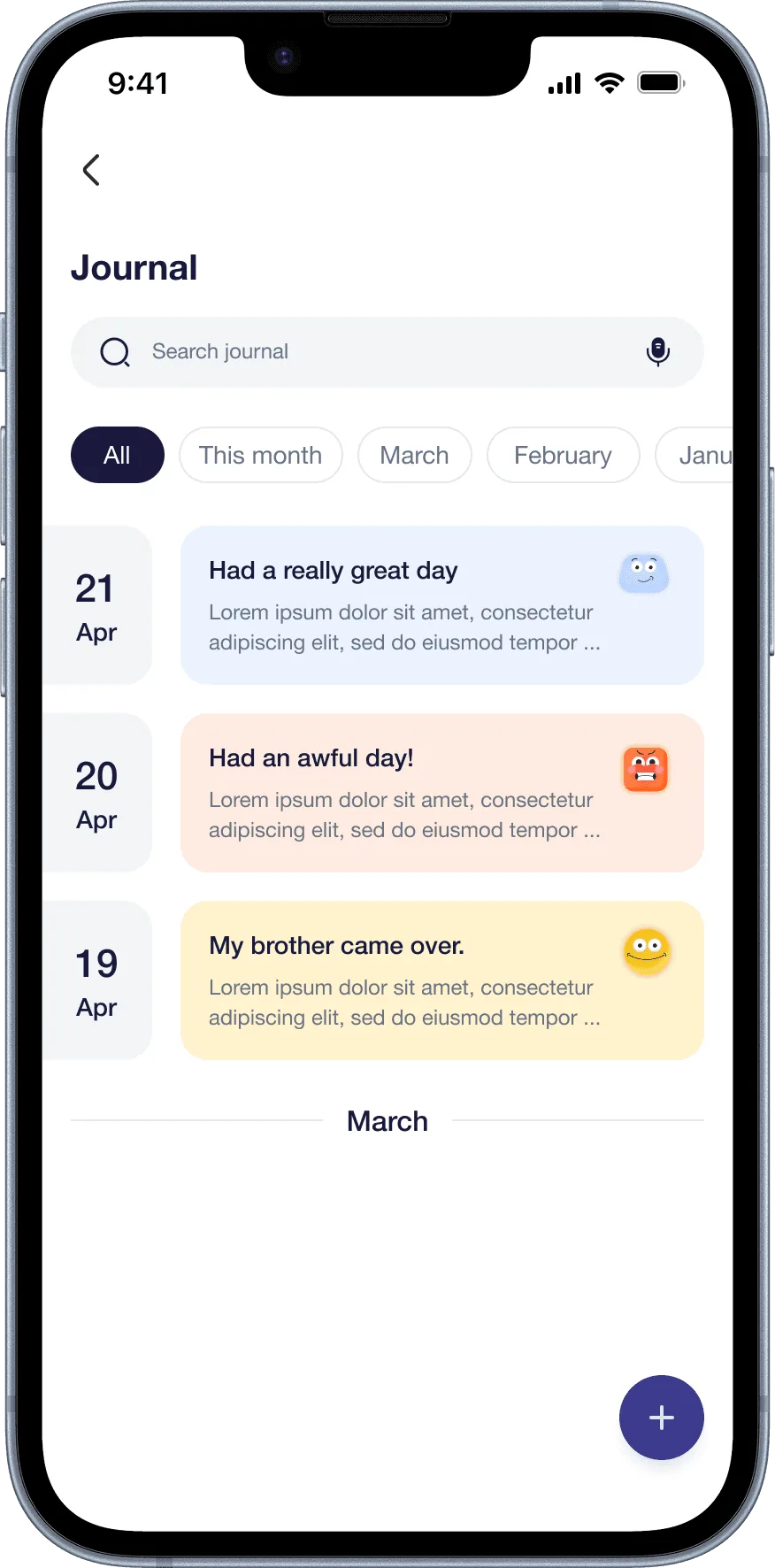
- Designed low-fidelity wireframes for the digital diary, home, conversational AI onboarding and community.
- Contributed to the high-fidelity designs across onboarding, home, therapist booking and community.
Design process
We followed a human-centred process across five stages, grounding each decision in real user needs instead of assumptions.
- 01
Empathise
A survey with 11 respondents on drinking habits, motivations and app use, plus existing research on alcohol, the brain and mental health in the UK.
- 02
Define
Four personas, two empathy maps and a clear problem statement. A key finding: 55% said health was their main reason to quit, yet 90% weren't using any app to help.
- 03
Ideate
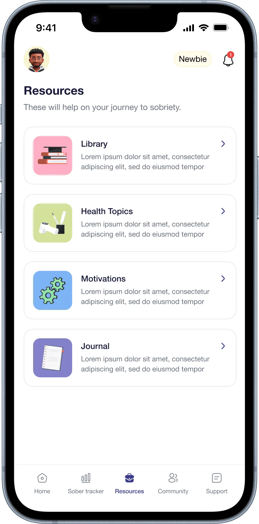
An information architecture in FigJam across six areas: Health Topics, Digital Diary, Conversational AI, Community, Therapists and Notifications.
- 04
Prototype
Paper wireframes for 12+ screens, then high-fidelity Figma designs covering onboarding, home, diary, community, therapist booking and health resources.
- 05
Test
We validated the prototype against our four personas. The community and digital diary resonated most, and wearable integration emerged as a future priority.
Key insights from research
Survey findings
- Drinking frequency: 5 in 10 drank 2–3 times a week; 2 drank 4 or more times, a clinically significant frequency.
- No apps in use: 9 in 10 didn't use any app to manage their drinking. The gap was real.
- Health as the motivator: 55% of those wanting to quit cited health, so the app needed to make health consequences visible and personal.
- Lifestyle-based attempts: most quit attempts relied on exercise, yoga or distraction, not structured support.
- Mixed appetite for help: 50% would seek professional help through an app, and 50% were open to a community of others trying to quit. Both had to be in the product.
Competitive findings
- Sober Sidekick: strong on community and anonymous sharing, but no proper progress tracker, and moderation risks with unfiltered posts.
- NHS Drink Free Days: good at awareness and milestones, but passive. It could help cut down, not help people overcome.
- Try Dry January: engaging moods, badges and missions, but not designed for long-term change.
No single app combined structured progress tracking, community, professional access and personalised AI support. That combination became Clink's core proposition.
Solution highlights
01
Conversational AI
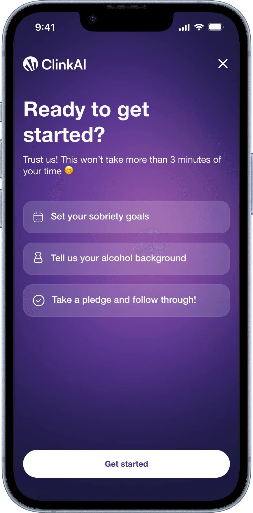
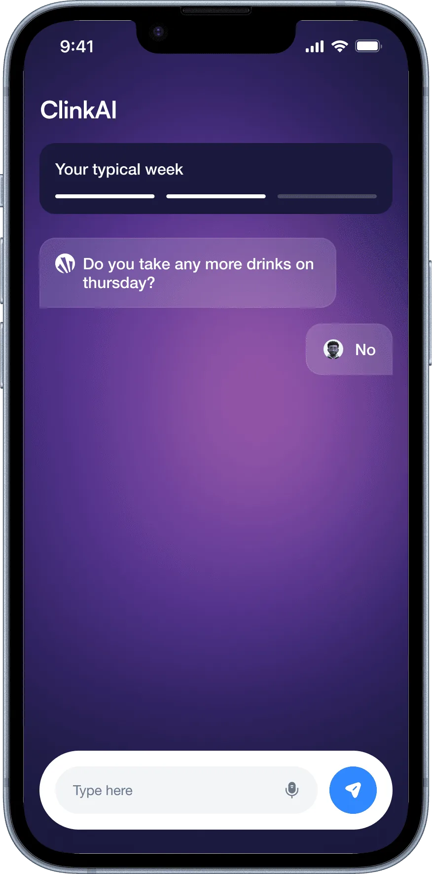
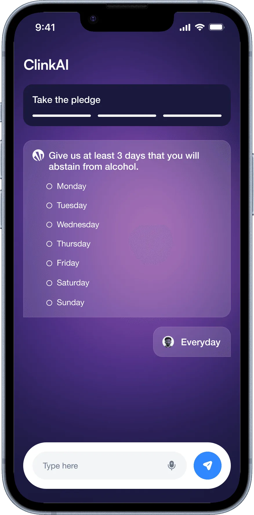
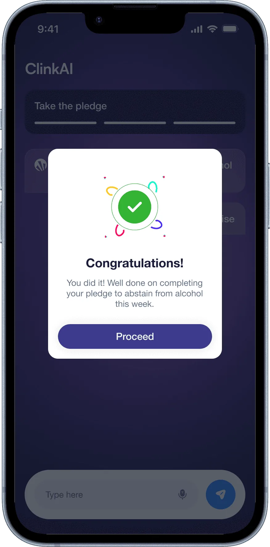
Most previous quit attempts relied on distraction, not structured support. The conversational AI gives people a private, non-judgemental space to reflect on cravings, log how they feel and get personalised guidance. It also doubles as onboarding: instead of a form, you answer questions in a conversation, so the experience feels human from the first moment.
02
A personalised dashboard
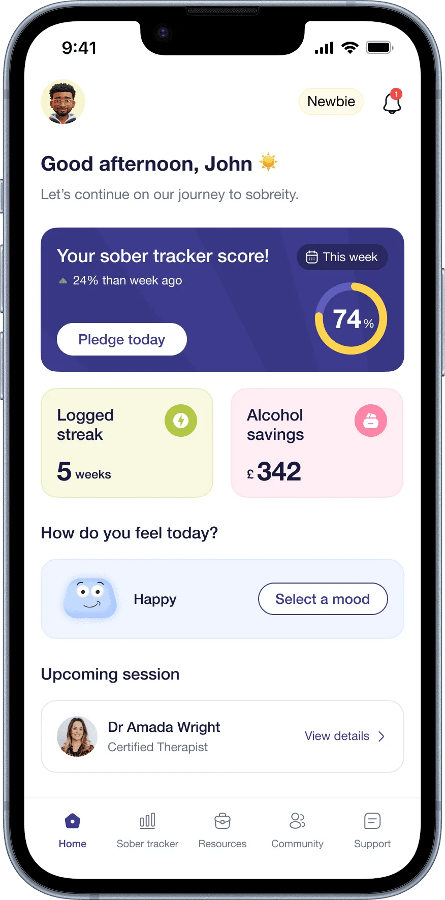
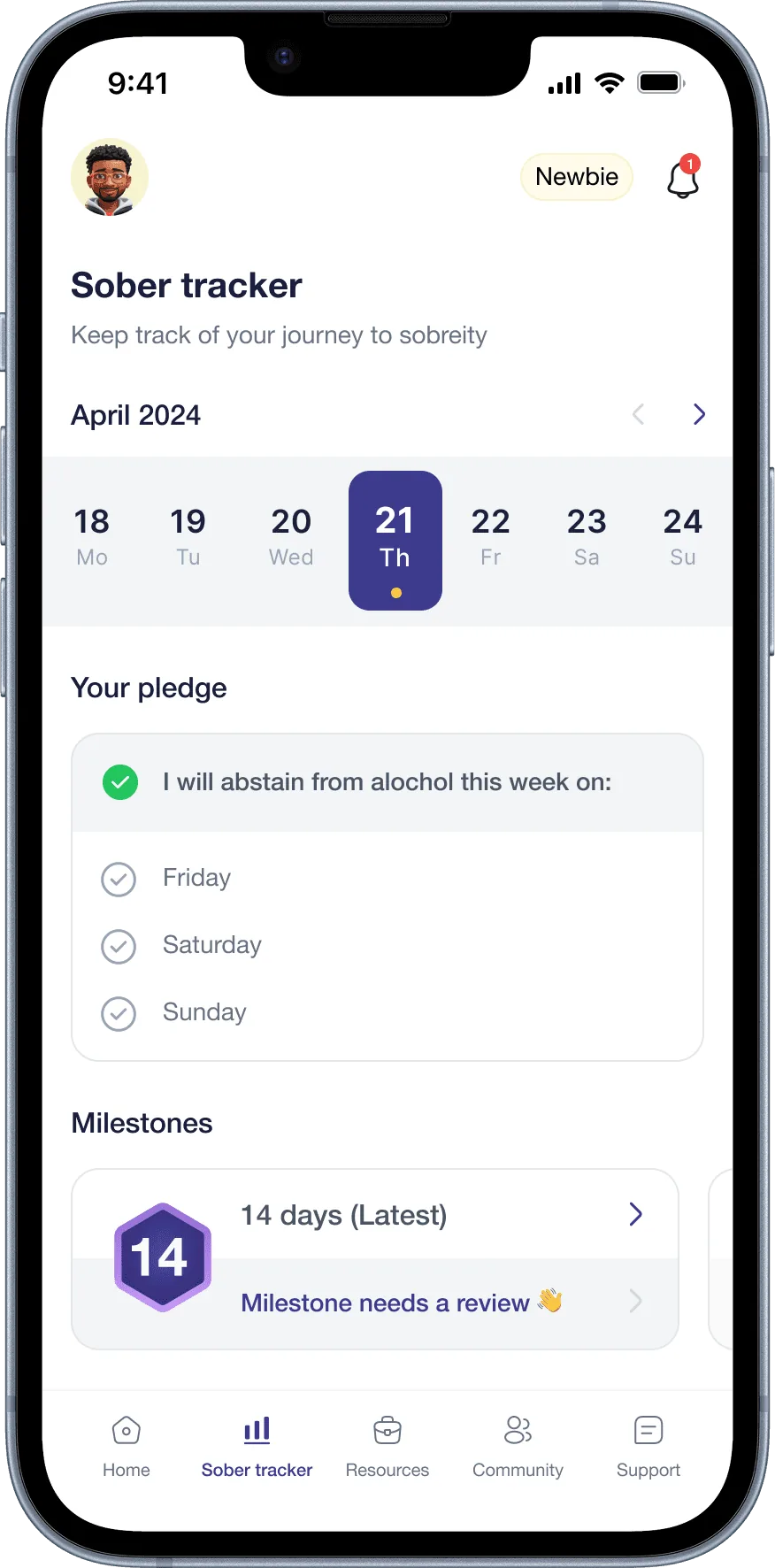
Existing apps tracked what people drank, not how they were changing. The dashboard brings together a sober tracker score, a logged streak, money saved and a mood check-in. Every metric answers a question people actually care about: Am I improving? What am I gaining? How do I feel today?
03
An anonymous support community
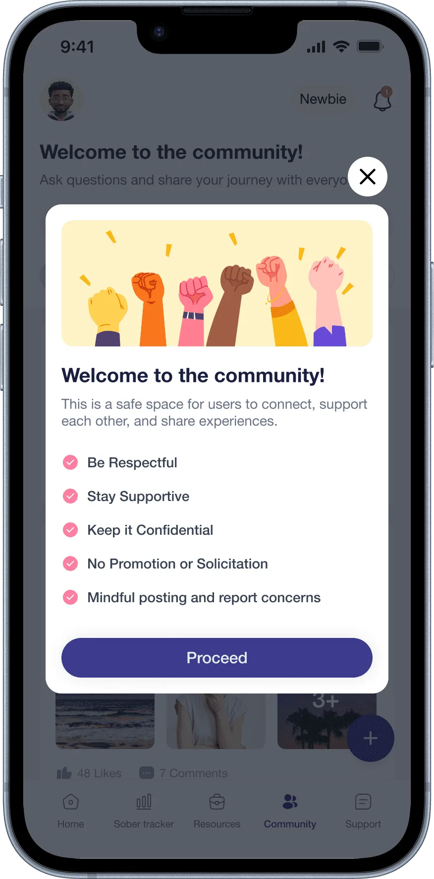
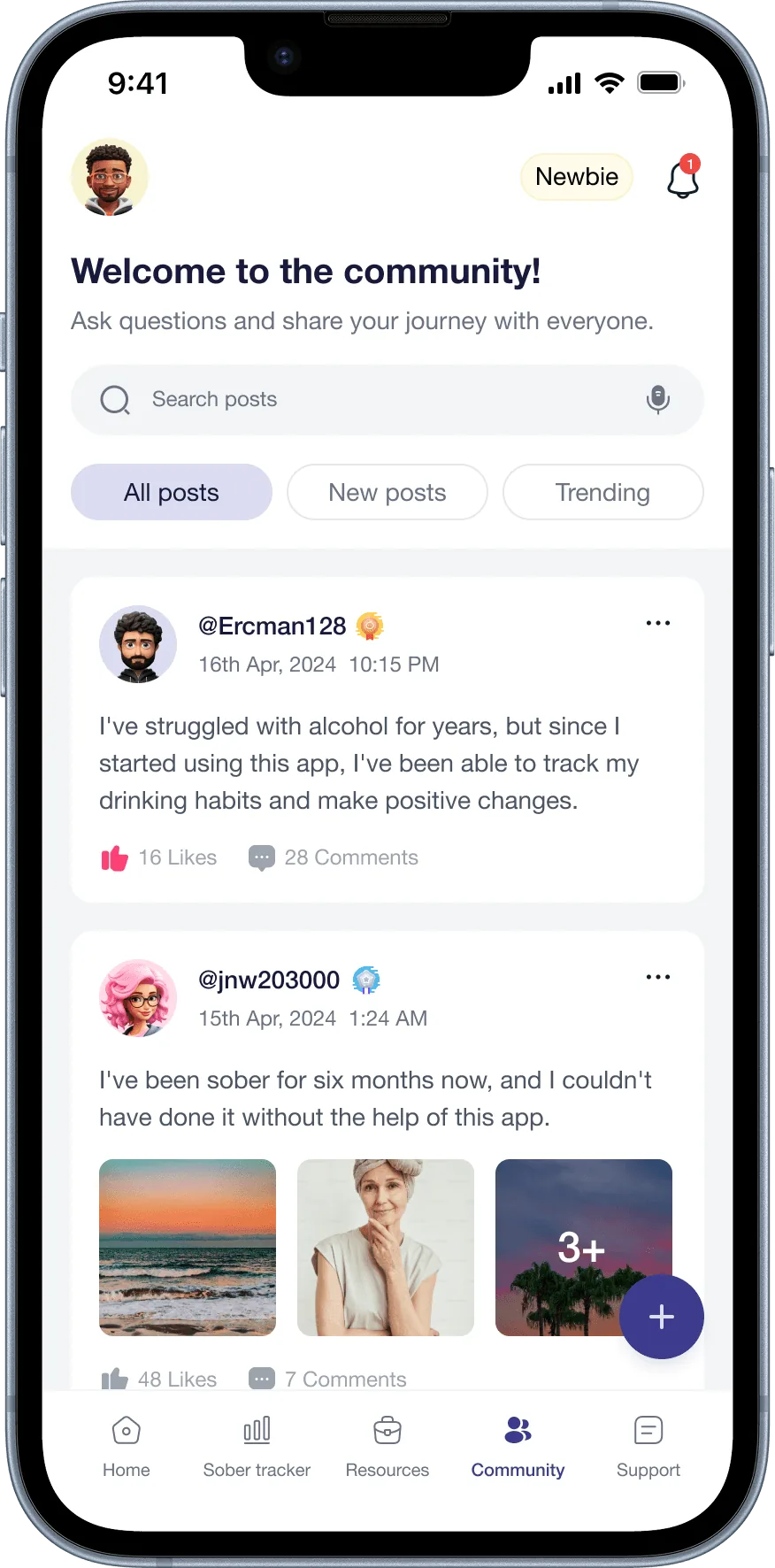
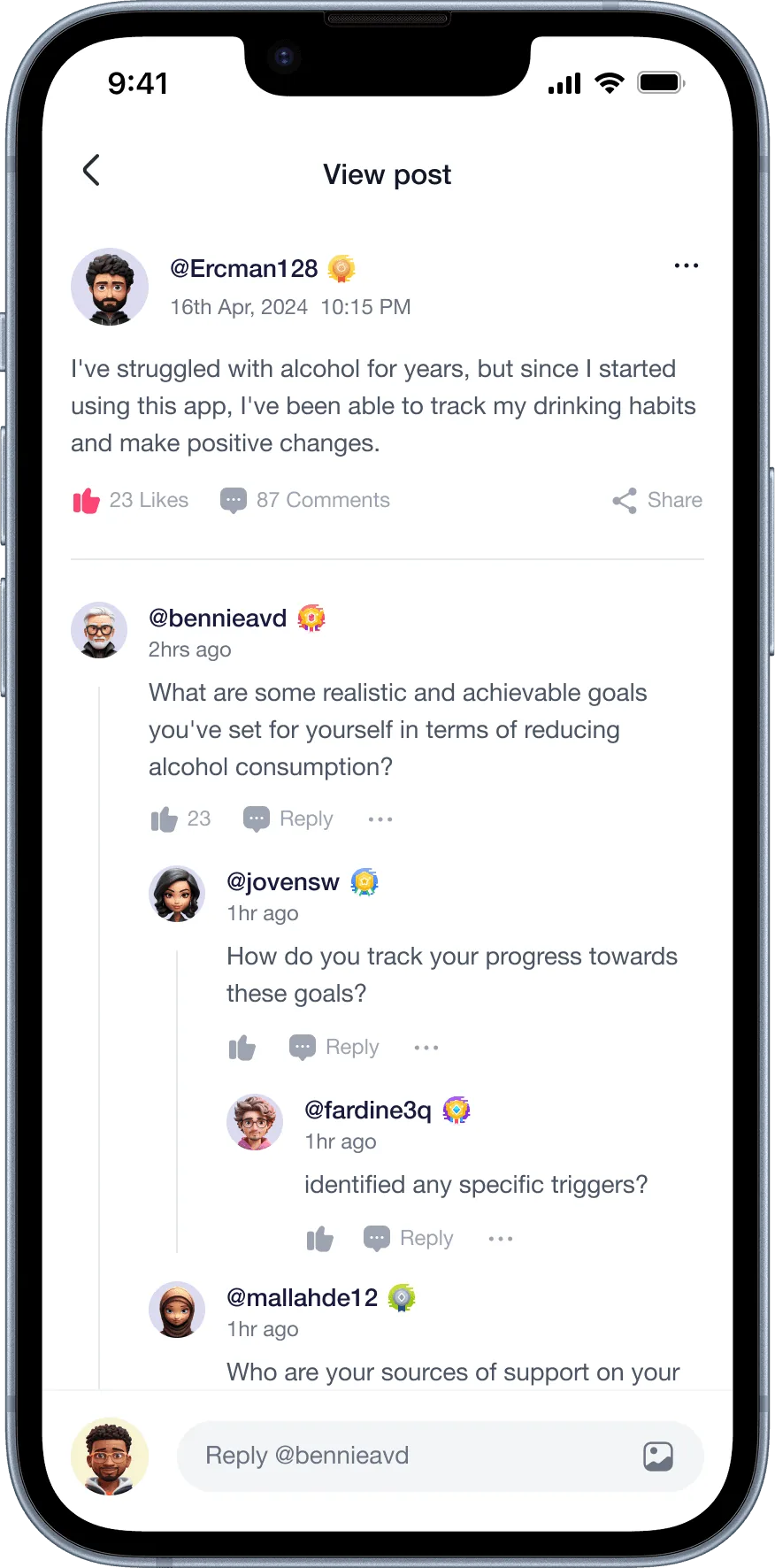
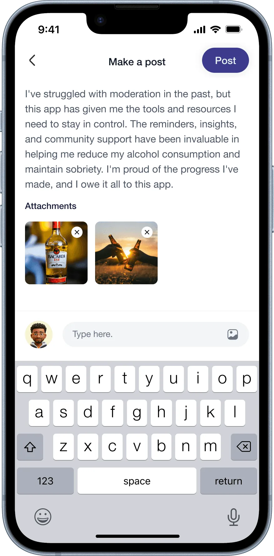
Half of respondents wanted to connect with others trying to quit, but stigma was the main barrier to seeking help. So the community is anonymous by default, with no direct messages, a deliberate answer to the safety weakness we found in Sober Sidekick. People can post, comment and give empathy badges in a moderated, safe space.
04
Therapist access
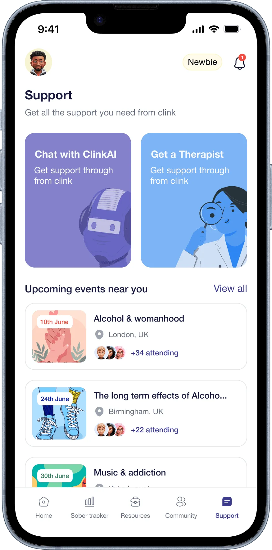
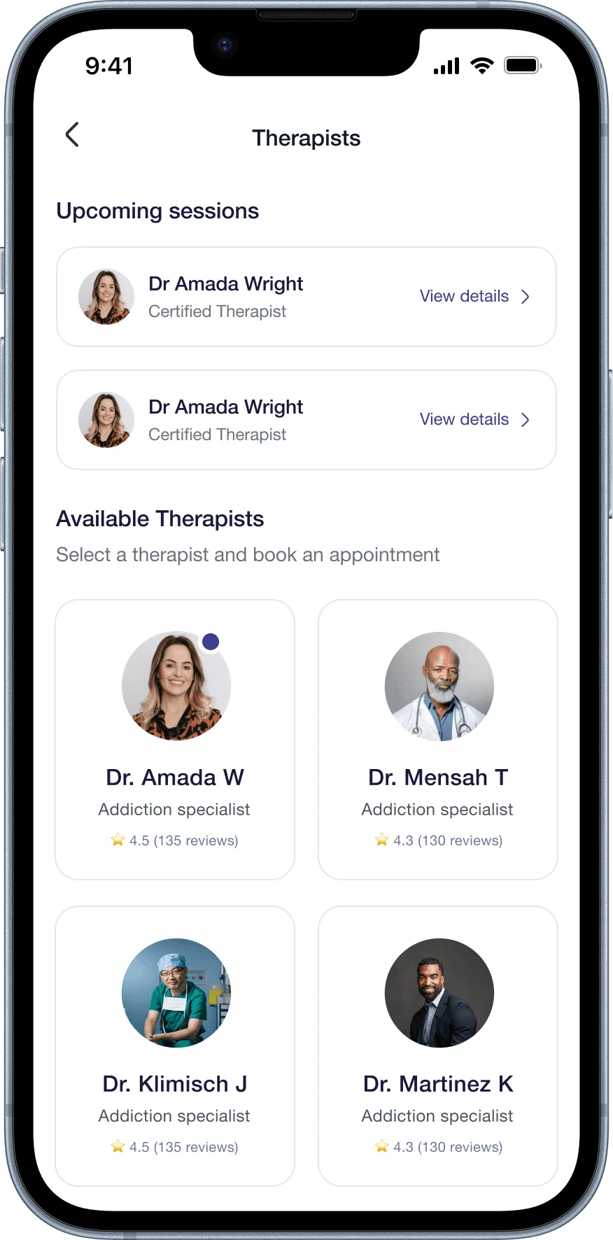
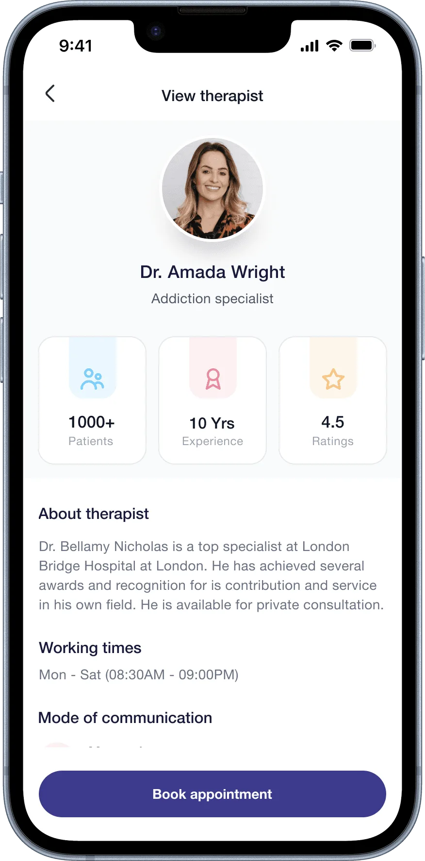
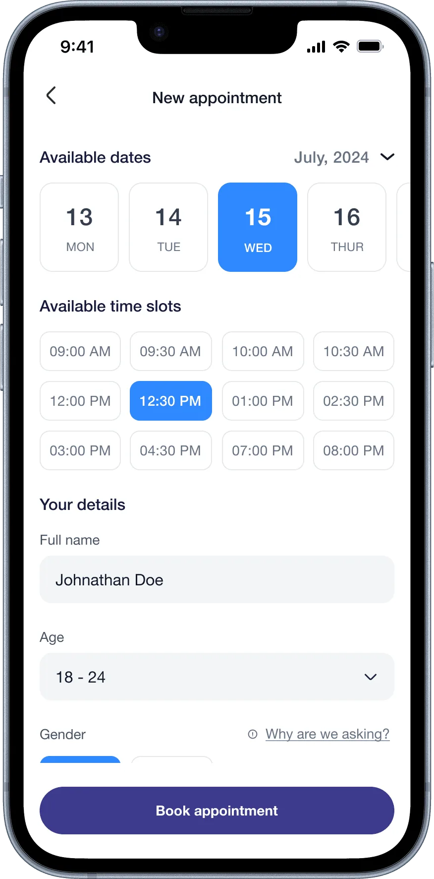
No existing app made it easy to reach a licensed therapist in the same experience. Clink lets people browse certified therapists, see their specialisms and patient numbers, and book directly with calendar integration and email confirmation. Credibility signals come before the booking step, addressing the trust barrier research surfaced.
05
Inclusive by design
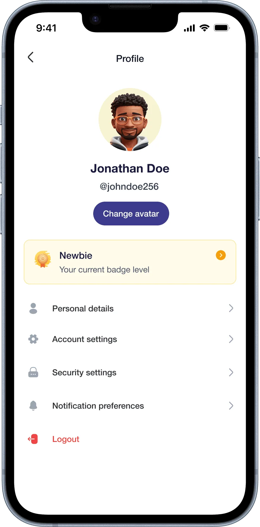
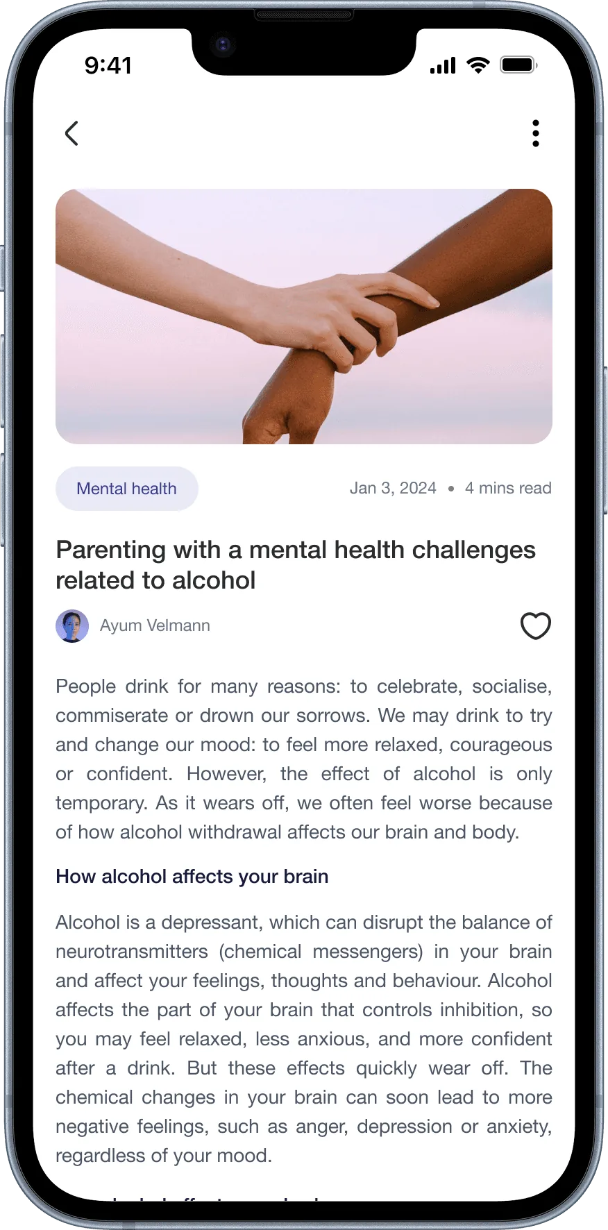
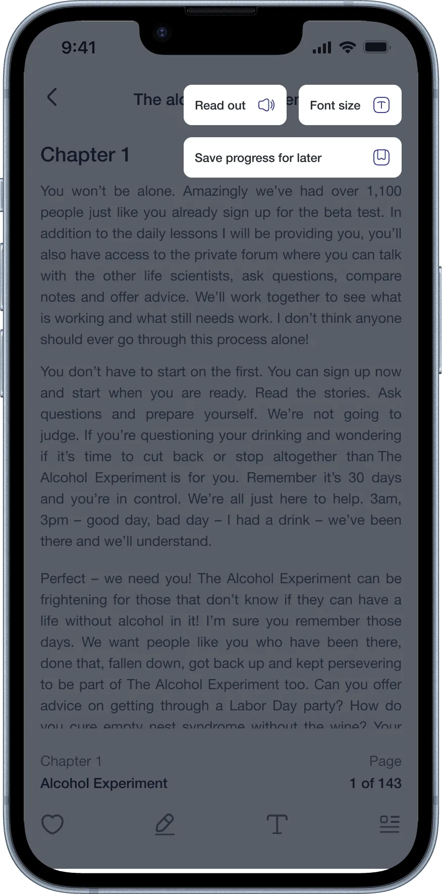
We designed explicitly for physical and sensory disabilities. William (paraplegia) and Maria (visual impairment) were full personas, not afterthoughts. For Maria, that meant screen reader compatibility, voice-guided navigation and accessible content formats. It made us question every decision: does this work if you can't see it? If you can't use your hands?
The results
- A working prototype tested with four diverse personas.
- Positive feedback on the community feature and digital diary.
- Strong validation for accessibility-first design decisions.
- Ready for further iteration and MVP development.
What I learned
- 01
People in recovery need safety, empathy and autonomy, not just tools
Every decision had to pass a test: does this feel supportive, or like surveillance? The difference between a tracker that motivates and one that shames is almost entirely in the framing.
- 02
Designing for inclusivity makes things better for everyone
Designing for Maria's visual impairment and William's paraplegia made us question assumptions we'd otherwise have left alone. The result was a more considered product for every user.
- 03
Sobriety is personal
People's reasons for quitting were deeply individual: health, family, money and self-worth. Clink lets people define their own version of success instead of imposing one metric on everyone.
- 04
Group design is a design challenge in itself
Coordinating four designers took the same skills as coordinating four stakeholders: clear communication, a shared language, and a willingness to critique and be critiqued.
Want to talk about this project? I'd genuinely like to hear from you.